Bridgit.io
Bridgit.io is a web overlay that advances the way communities view, share and engage with information on the web.
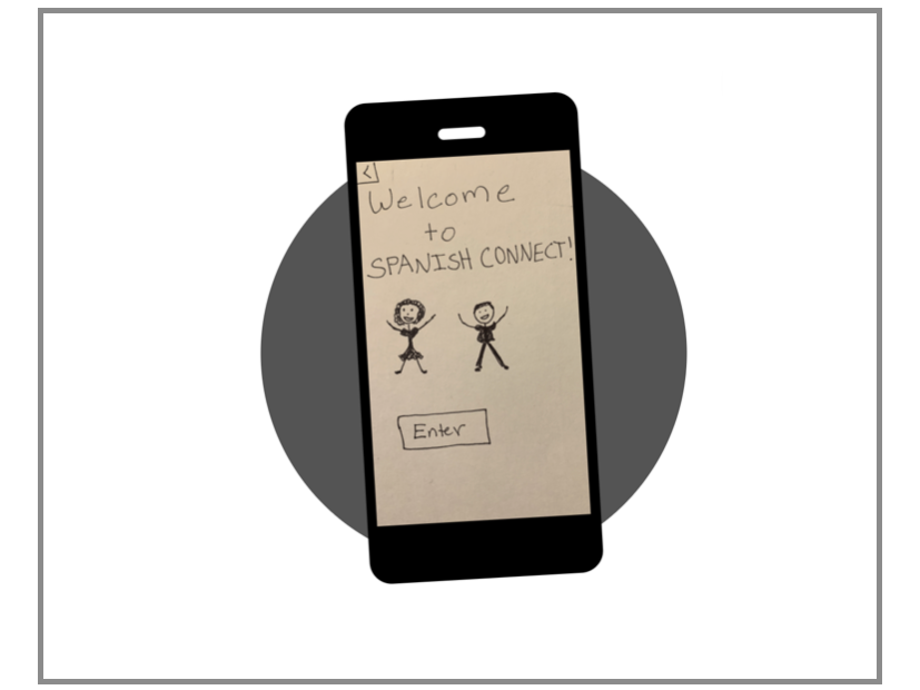
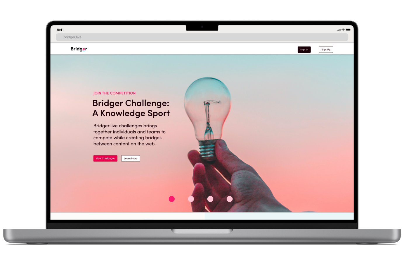
Bridger.live
Bridger.live is a virtual learning website under the umbrella of Bridgit, which allows users to create Bridges that connect information between pieces of content on the internet. Individuals and teams are brought together to compete in challenges while creating these Bridges.
A Place to Start
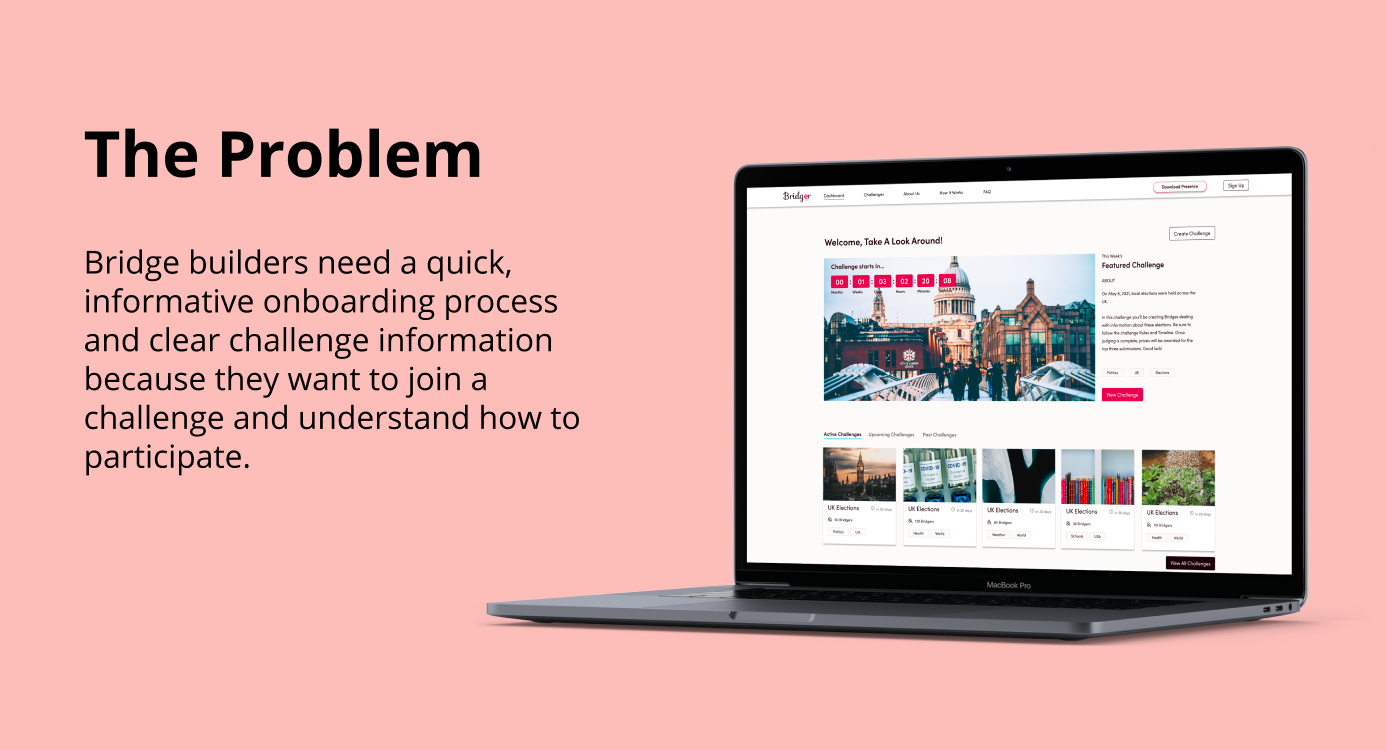
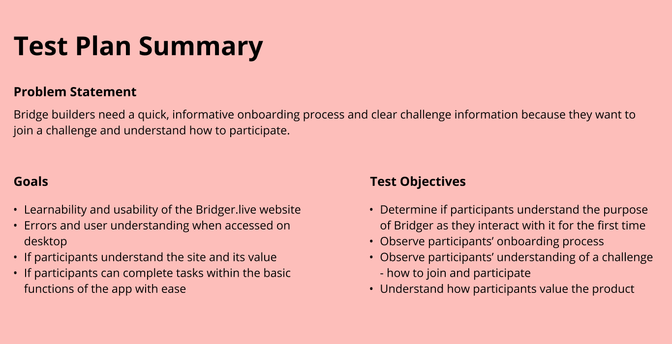
Our team was tasked with conducting usability tests on the design of Bridger.live. We were asked to test three main user flows of the product:
• Creating an account and logging in
• Finding a challenge to join
• Joining a challenge
We were also asked to discover if users understood the site and its value.
Research and Preparation
I took the time to research the product, target audience, user flows, and information architecture that was already in place. From there I was able to help define the problem space we were testing.
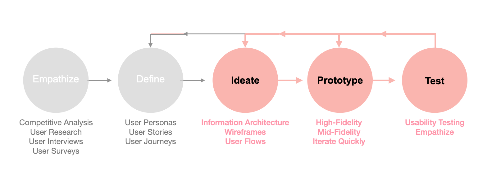
The Process
To approach the problem I focused on the Ideate, Prototype, and Test phases of Stanford Design's Design Thinking Process
Usability Testing
My Role
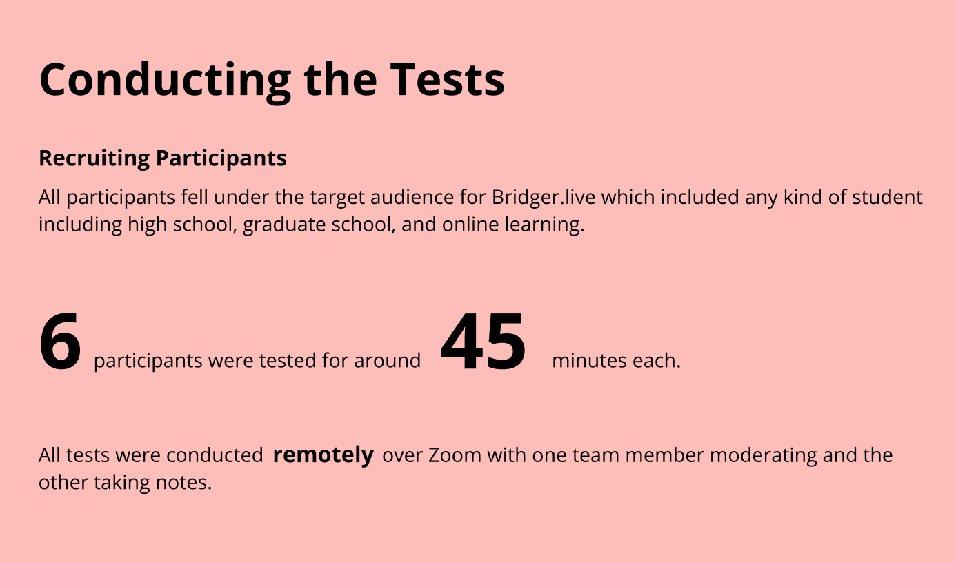
I was personally responsible during usability testing for:
• Writing the test script
• Recruiting participants
• Moderating remote tests
• Observing and taking notes on the tests I didn't moderate
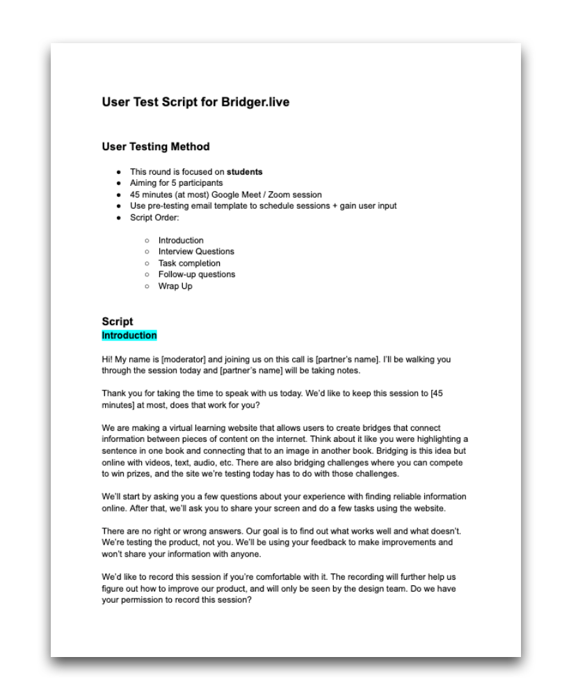
Test Script
I used the test plan, goals, and objectives to write the script for our participants.
Usability Vs. Value
I kept questions about the value and purpose of the product separate from the tasks we asked participants to accomplish. This came in the form of follow-up questions. For example:
"How would you explain Bridger.live to a friend and what its purpose is?"
Script Structure
• Introduction
• Interview Questions
• Task completion
• Follow-up questions
• Wrap Up
Test Script Link
To see the full script click here
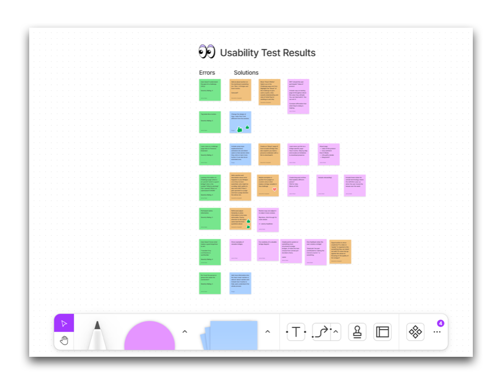
Analyzing the Results
After analyzing the results in a rainbow spreadsheet we focused on the 5 errors with the highest severity ratings. (based on Jakob Nielsen's severity rating scale) The majority of these errors resulted in a lack of clarity. Users expressed confusion in the following areas:
• How a challenge works
• How to win a challenge
• Why should they join a challenge
• Confusion on the terminology
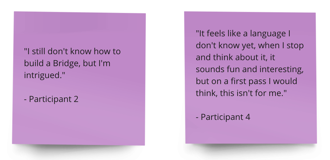
Notable Quotes
Brainstorming Solutions
I Love Collaboration
I contributed to the workshop we conducted using Fig Jam, in order to come up with solutions to the errors we found during usability testing.
I have an interest in information architecture and making things understandable so I chose to work on the solutions that addressed adding clarity for users.
Designing Solutions
My Role
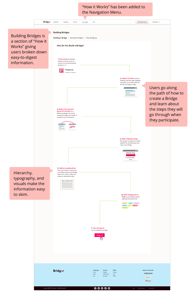
In order to resolve the issues that we found, I designed a new "How it Works" section of Bridger.live, giving new users a place to get the information they needed without cognitive overload on their Challenge Dashboard.
This new section is accessible from the Challenges page, fixing the "Learn More" link that users tried to click on during testing, as well as the navigation menu.
* All design solutions followed Bridgit's Design System and Brand guidelines.

How it Works Page
I reviewed the confusion our users had and separated their issues into two categories:
1. Bridges - How do you build a bridge? What makes a good Bridge? Why should I participate?
2. Challenges - What is the terminology? How does it work? What does winning look like?
Bridges
I divided the Bridges page into 3 tabs:
• Building a Bridge • Valuable Bridges • Why Bridging
Building a Bridge
The majority of users said they didn't know what Bridging was or what it would look like while exploring challenges. This led to feelings of "this isn't for me."
As a solution to this problem, I created a storyline describing how building a Bridge works:
• Hierarchy & Typography make it easy to skim
• Visuals are used so users know what to expect
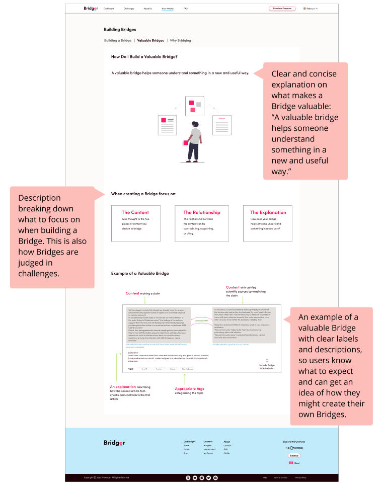
Valuable Bridges
Many users expressed concern that they didn't know what would make their Bridge "good" or "valuable." If they were going to build Bridges to compete in challenges they wanted to know what makes a good Bridge.
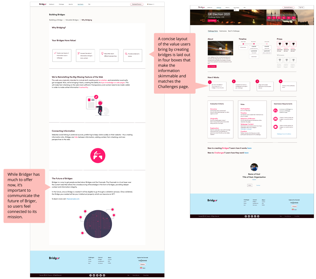
Why Bridging
A common question among users also included wondering if their Bridge building and participation mattered:
"I wonder if my contribution is worthwhile?"
The "Why Bridging" page aims to resolve this issue by laying out why these Bridges matter and how they're helping to add transparency to the web by connecting information.
This page also helps to communicate the stakeholders' mission of the company, while not giving the user cognitive overload.
Challenges
I divided the Challenges page into 2 tabs:
• What Happens to My Bridge • Roles
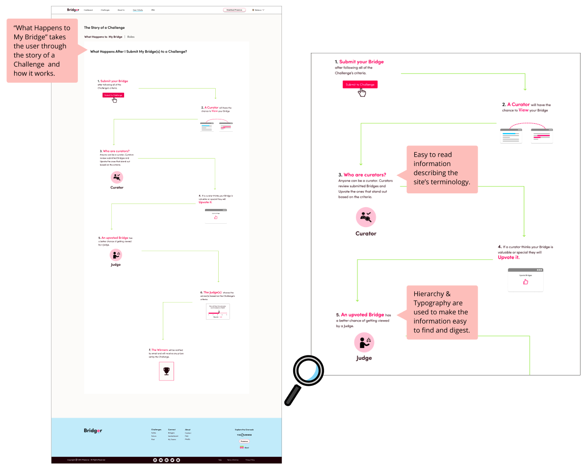
What Happens to My Bridge
This page lays out how a challenge works and describes the terminology many users had questions about in a concise and visual way.
"How do I win?"
"What is an Upvote?"
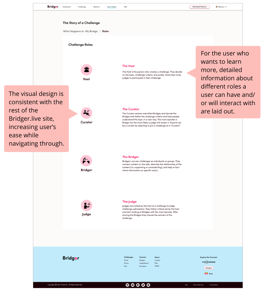
Roles
This page lays out detailed information about all the roles involved with a challenge aiming to answer questions many of the users had such as:
"Who is a curator?"
"Who can be a judge?"
Next Steps
I presented my design solutions to the CEO, design team, and developer. The next steps would include:
• Conduct another round of user testing to analyze if the solutions are solving the problem and errors
• Continue to iterate on the design based on user testing
Lessons Learned
Users can feel intimidated if the information is not presented in a clear and concise way.
During the usability tests, I found out first-hand how quick users are to dismiss a product as "not for them" when they feel overwhelmed by the information. Breaking down information and adding clarity for users not only helps them figure out how to use a product, but also adds a more accepting and welcoming feel.
Constant communication makes all the difference.
I began feeling overwhelmed breaking down the complex concepts of Bridgit.io and Bridger.live. It was my job after all to make the information easy for users to understand. However, I quickly learned that the more questions I asked and the more time the CEO generously gave to discuss the product, the better understanding I had, and the better I could serve the users.
Let's Connect!
I'm looking for job opportunities to make a meaningful impact as a UX designer.
Contact Me