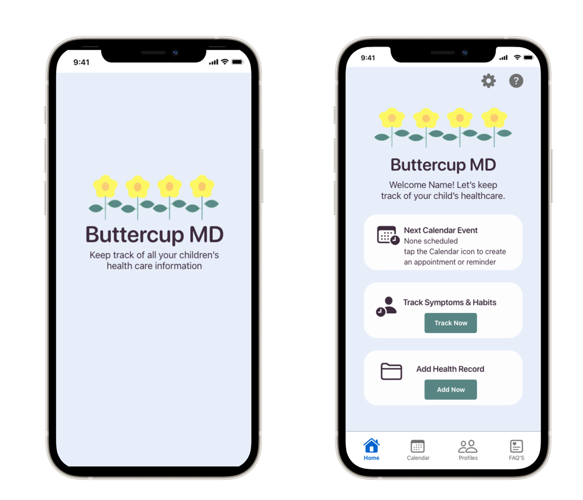
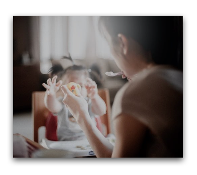
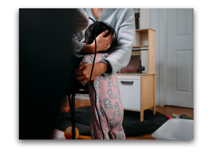
Helping Parents Keep Track of Their Children's Health Care.
Life Gets Busy.
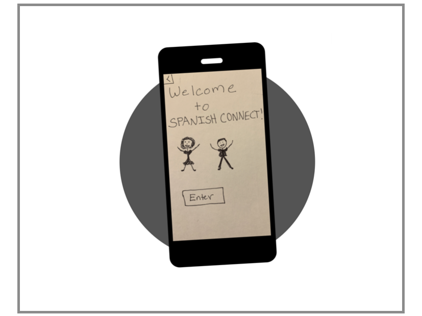
Buttercup MD is a native app that assists parents and caretakers in keeping track of all their children's health care needs. Organizing health information for children can now be done all in one place.
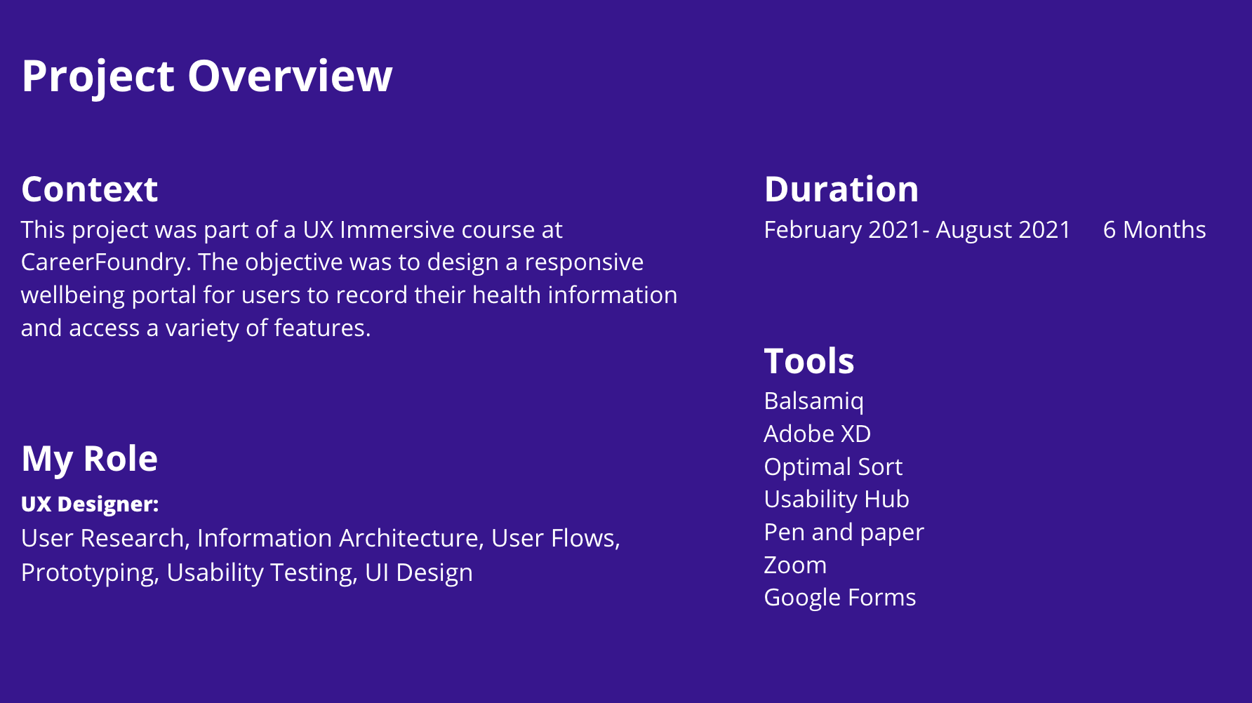
The Problem
Parents need a way to keep track of their children's healthcare because life gets busy and the health of their children is important to them.
The process
To approach the problem I used Stanford Design's Design Thinking Process
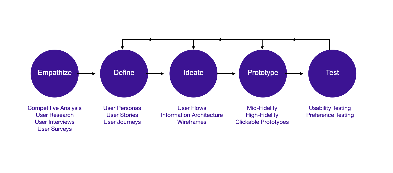

Empathize
Competitive Analysis
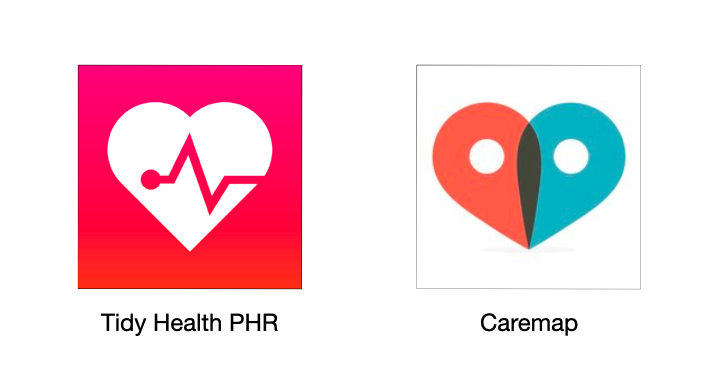
While researching potential competitors of Buttercup MD, I chose to do a competitive analysis on Caremap and Tidy Health PHR because they were the most similar to the product I was designing.
Takeaways
The Gap
• There aren't many products that keep track of health records AND track children's symptoms and habits.
The Opportunities
• Create an application that allows parents to keep track of records, medications, appointments, and symptoms for more than one child.
• Create an emotional connection with the parents using the app.
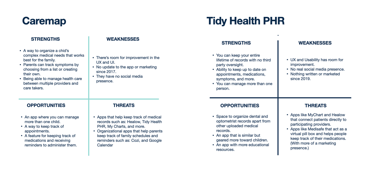
SWOT Charts
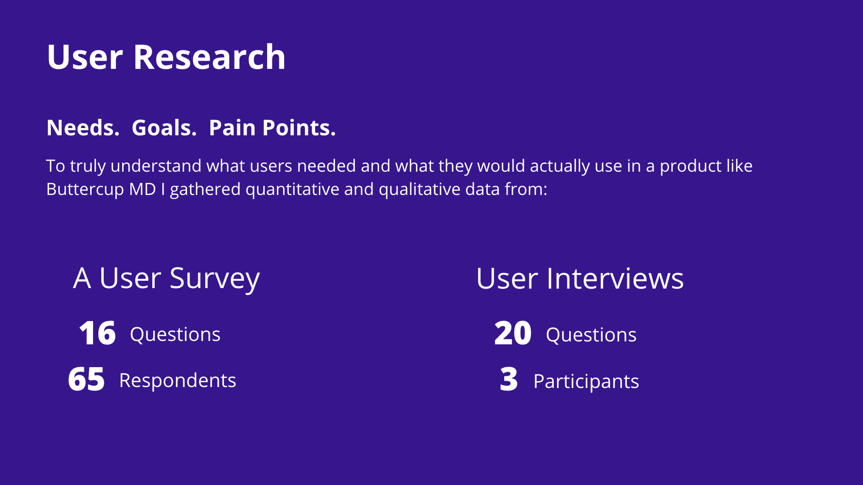
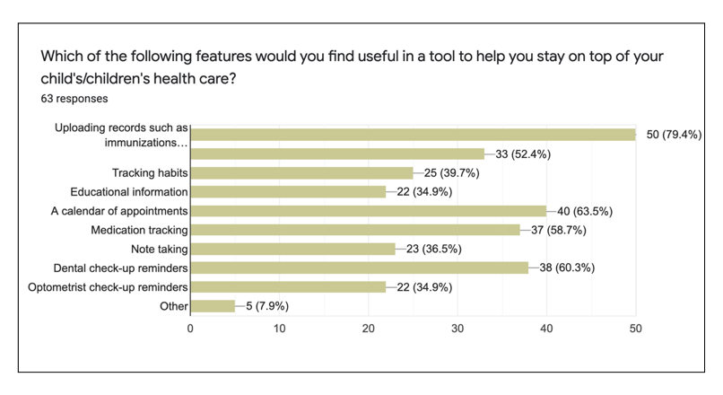
User Survey Results from Google Forms
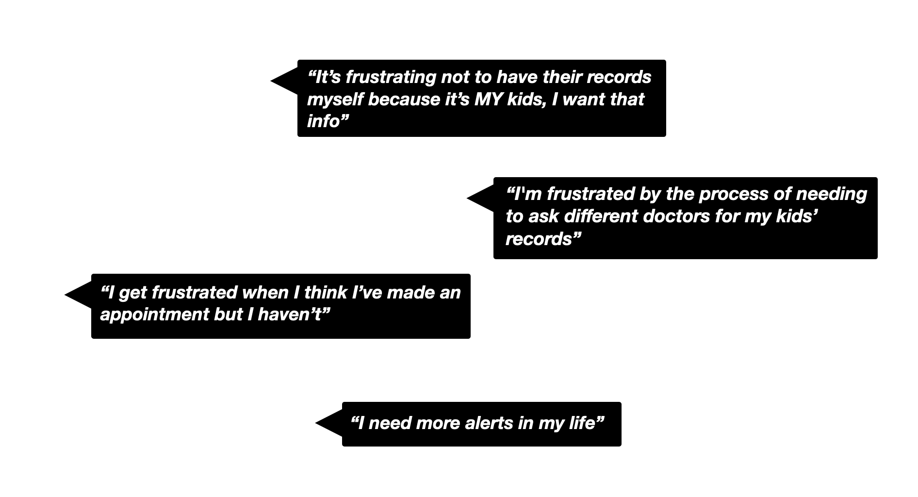
User Interview Quotes
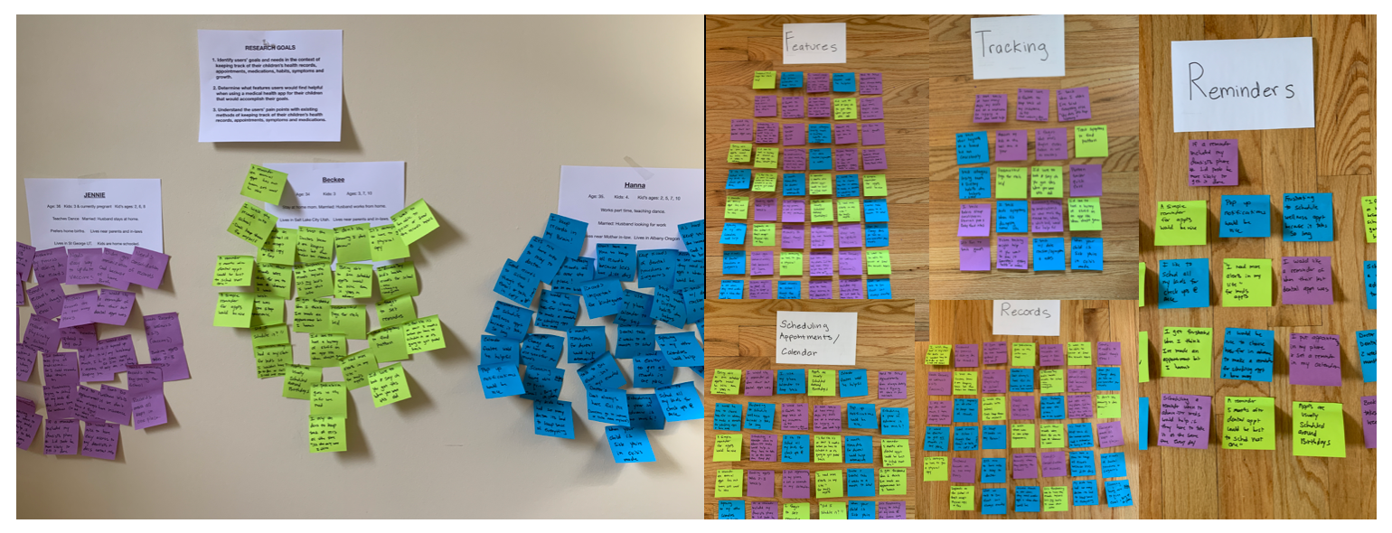
Affinity Mapping Insights From User Interviews
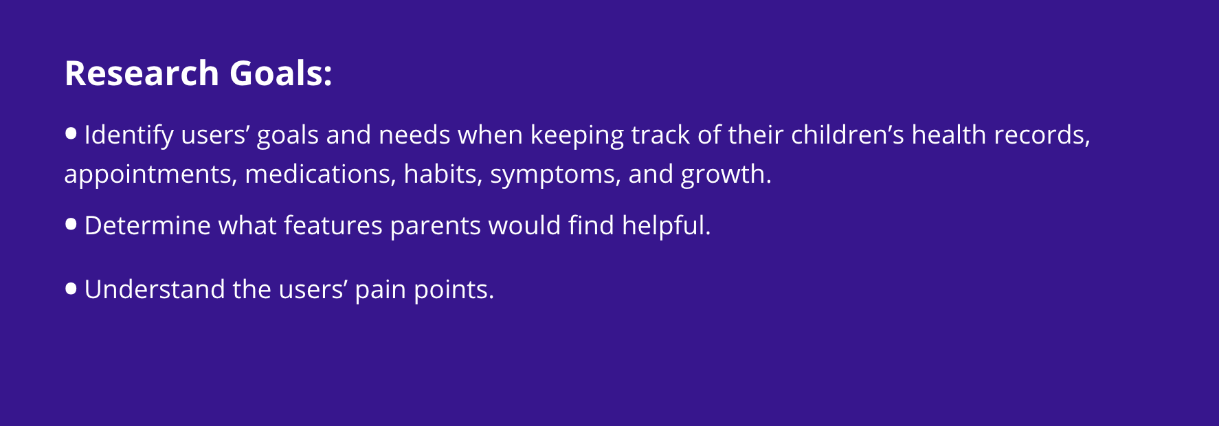
Research Insights:
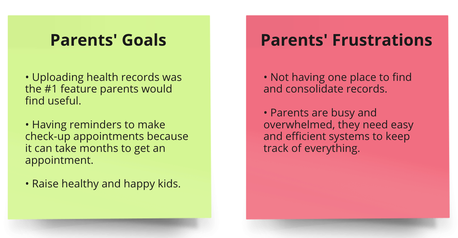
Parents need Simple. Easy. Efficient.

Define
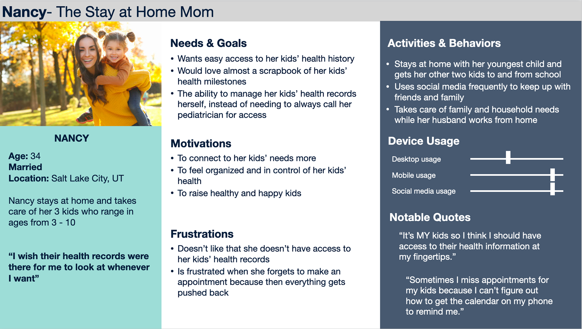
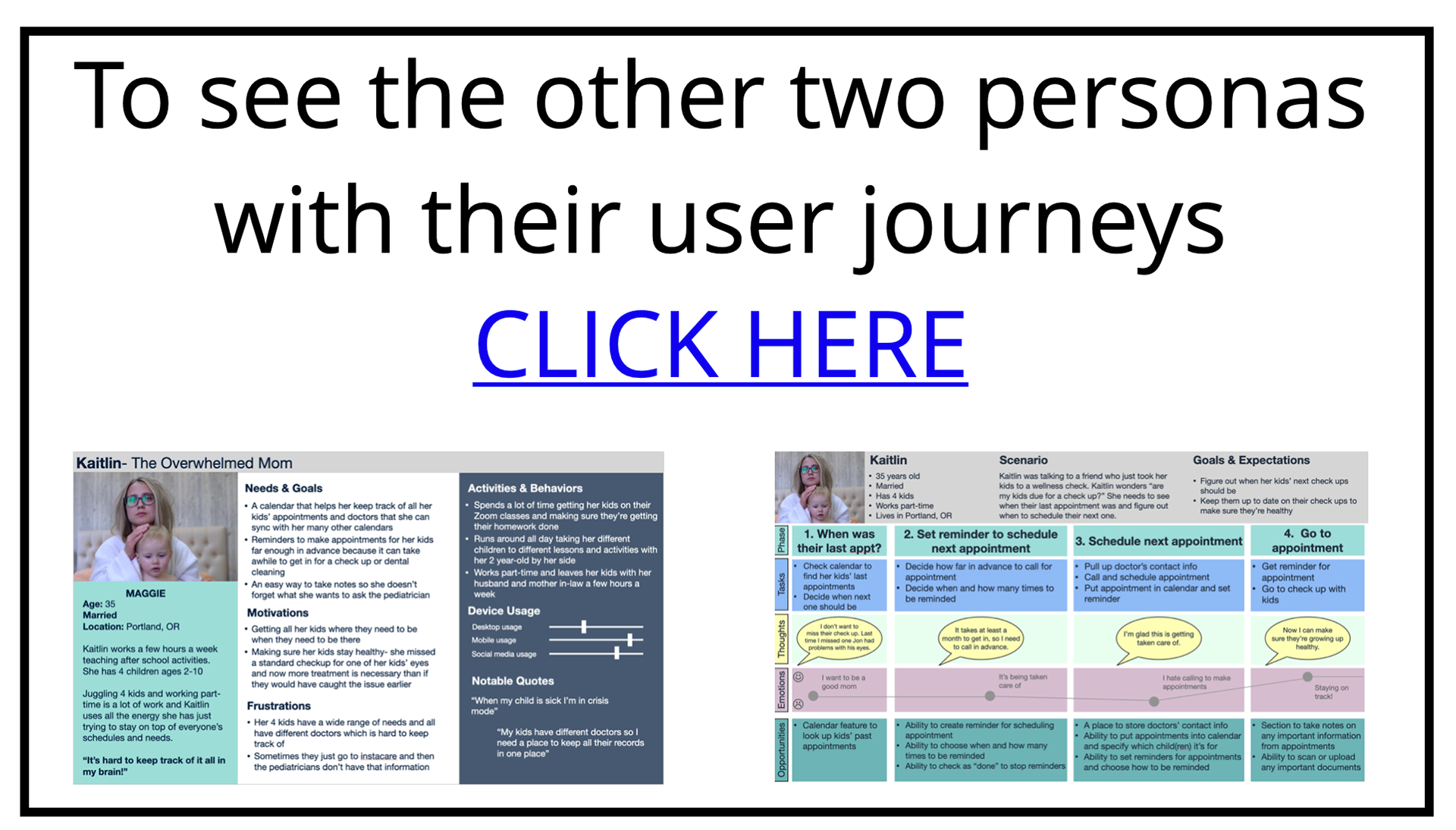
Personas
Based on the qualitative and quantitative data from my user research I created three primary personas for Buttercup MD to represent real users. Below is one of those personas, Nancy- The Stay at Home Mom.
Nancy- The Stay at Home Mom
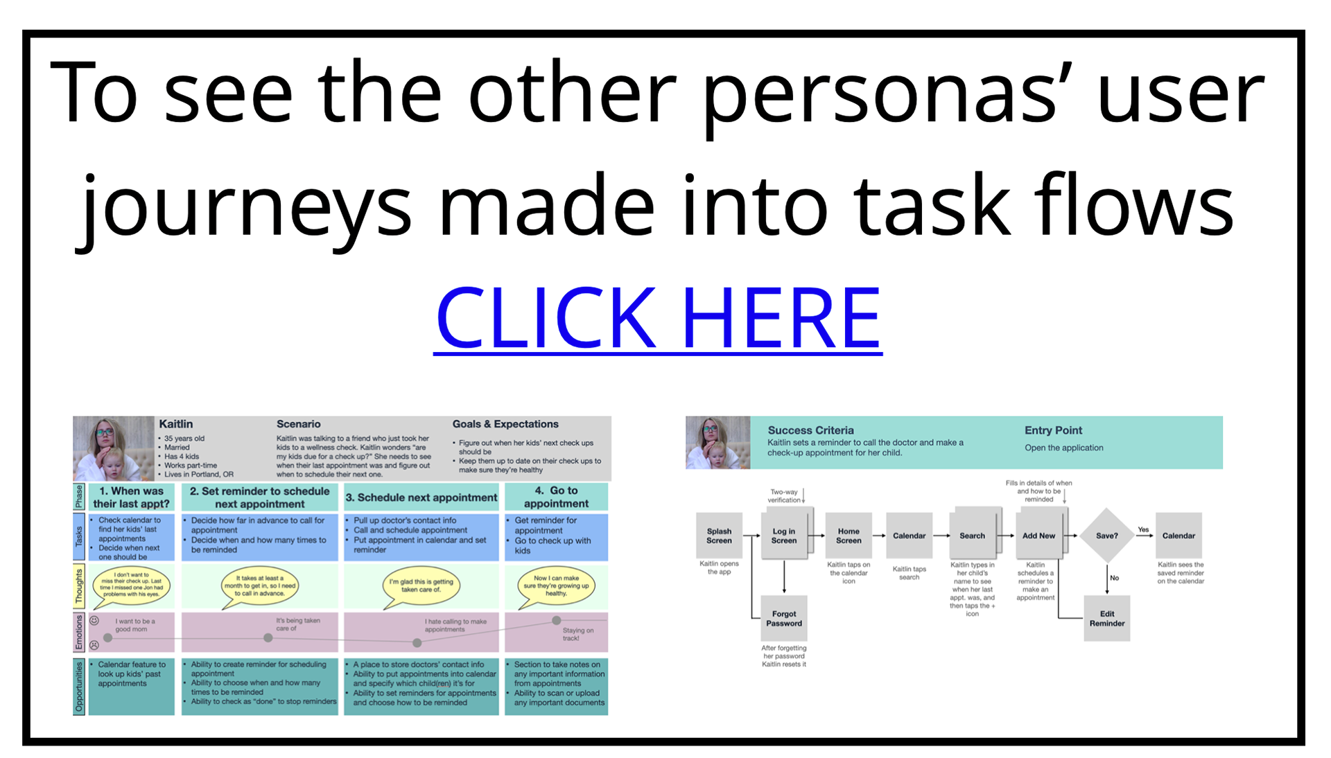
Task Flows and User Journeys
To ensure I was solving real problems I:
• Came up with a primary task for each persona based on their needs and goals.
• Made a user journey for each task.
User journeys helped me get into the mindset of the personas and find empathy for what they encounter on a daily basis.
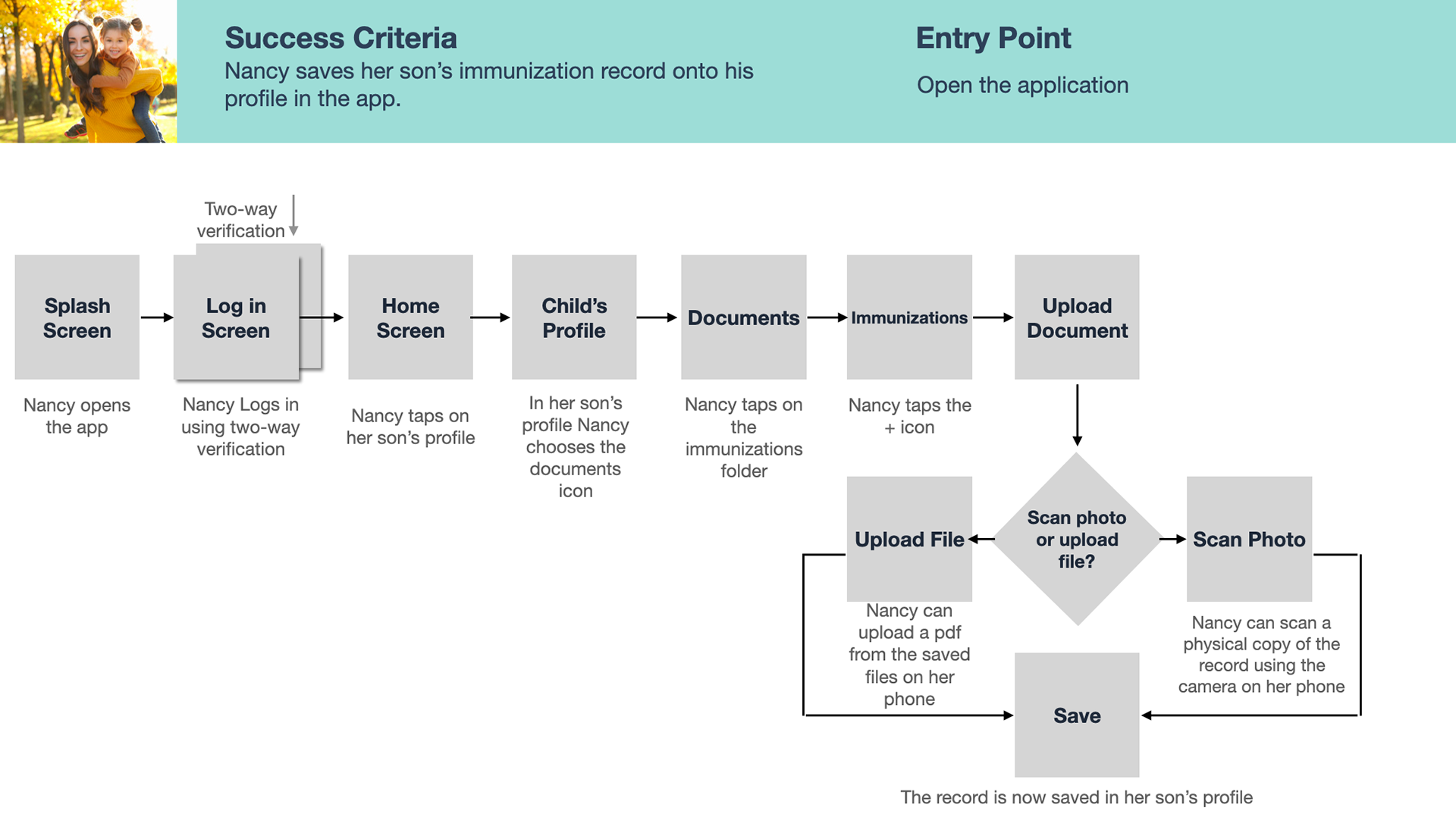
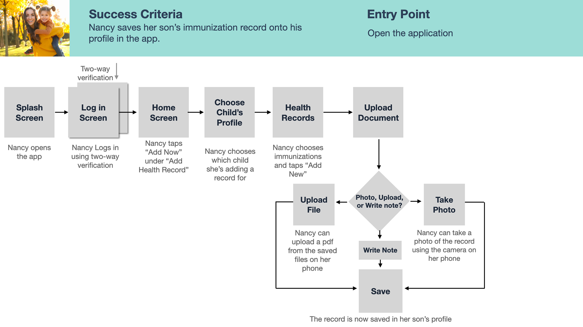
Nancy's Need:
Save an immunization record to her child's profile
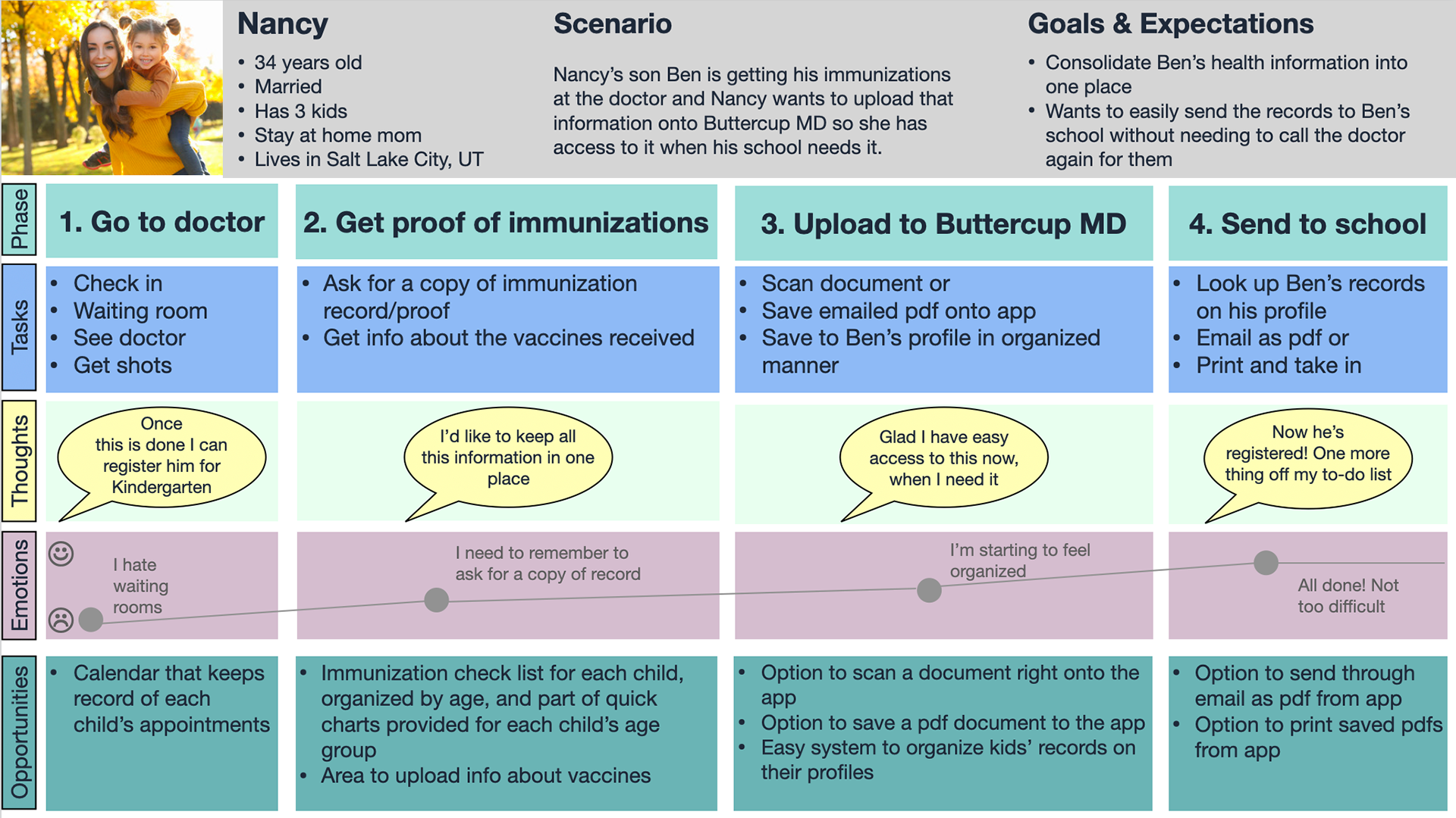
Nancy's User Journey

Ideation
After gaining a better understanding of the users' needs and pain points it was time to start generating ideas and solutions through task flows, information architecture, and wireframes.
I started by translating each user journey into a task flow.
Nancy's Task Flow
Nancy's flow takes her through the process of logging in to the app and uploading her child's immunization information through their profile page.
*** After user testing, this flow was made more efficient by allowing Nancy (the user) to upload a record right from the homepage. A revised version is shown further below under "Usability Testing."

Nancy's Task Flow
User Research/Information Architecture
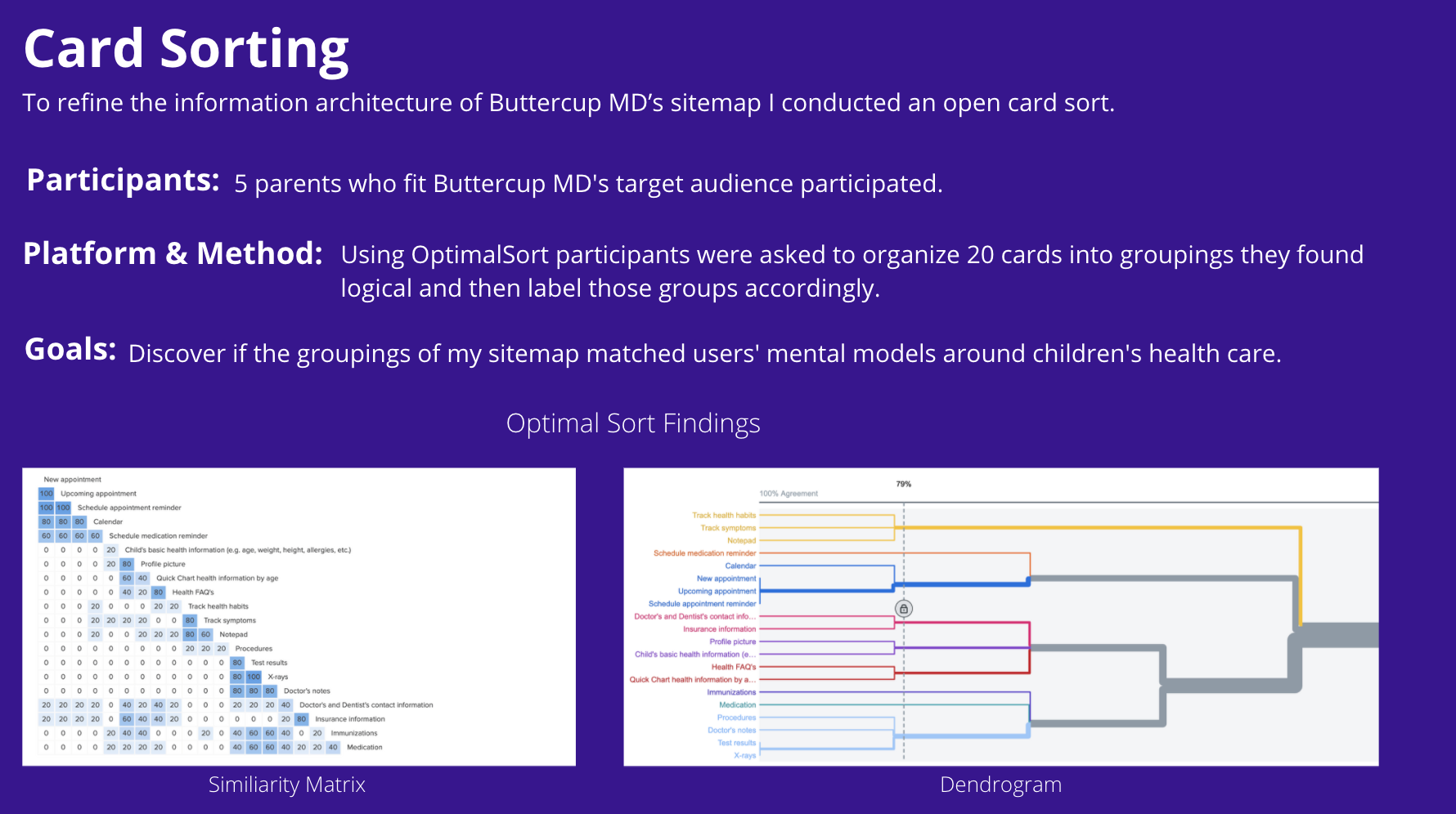
Card Sort Findings
• Users grouped insurance information with doctors' and dentists' contact information rather than with a child's documents.
• Users grouped the notepad with tracking rather than having it on its own.
• Users never used the word "documents" related to health records. Most of them used "records" or something similar.
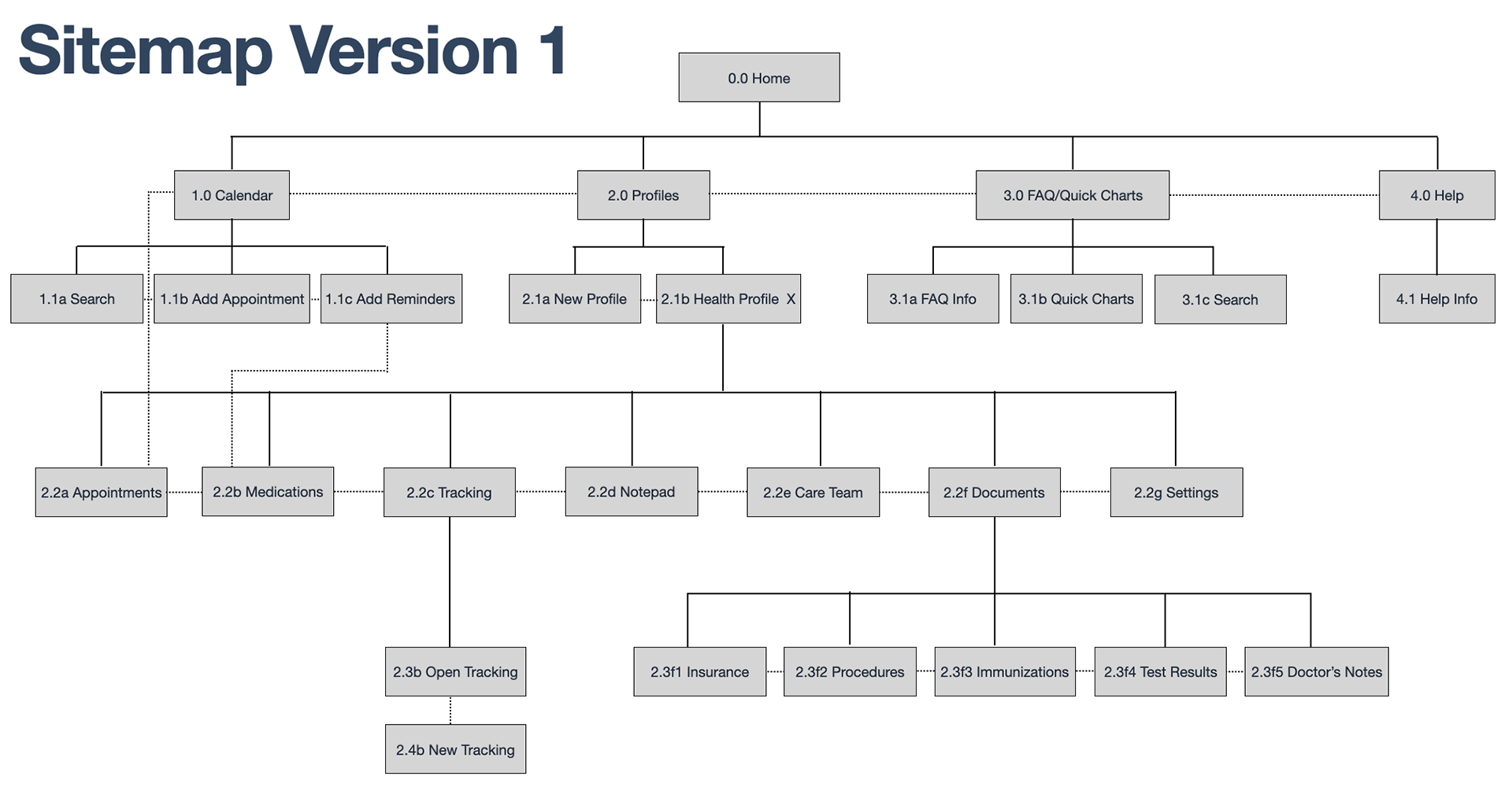
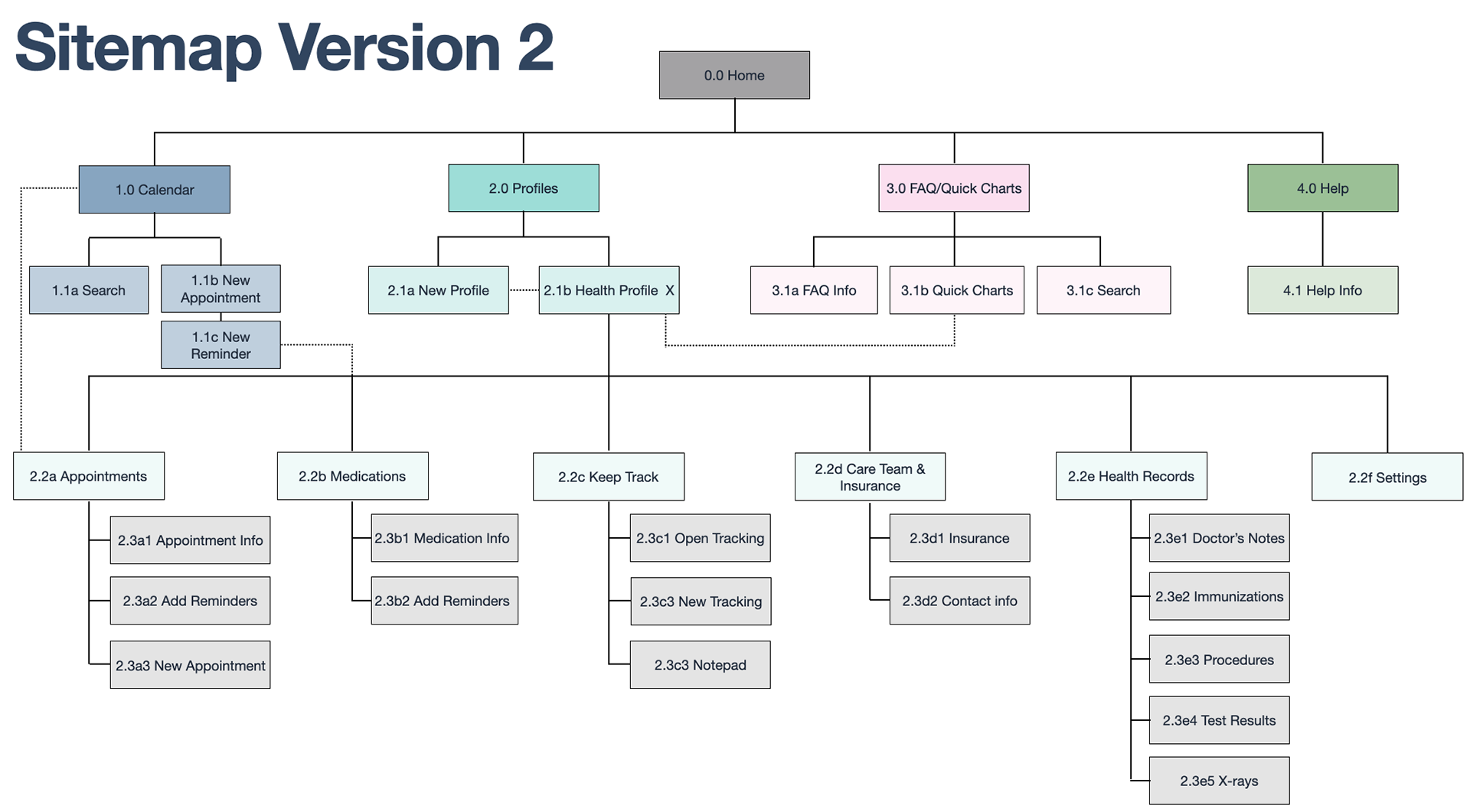
Refining The Sitemap
Based on the card sort findings I refined the sitemap.
Wireframes - Ideas coming to life
I created low and mid-fidelity wireframes to bring the user flows and information architecture to fruition.
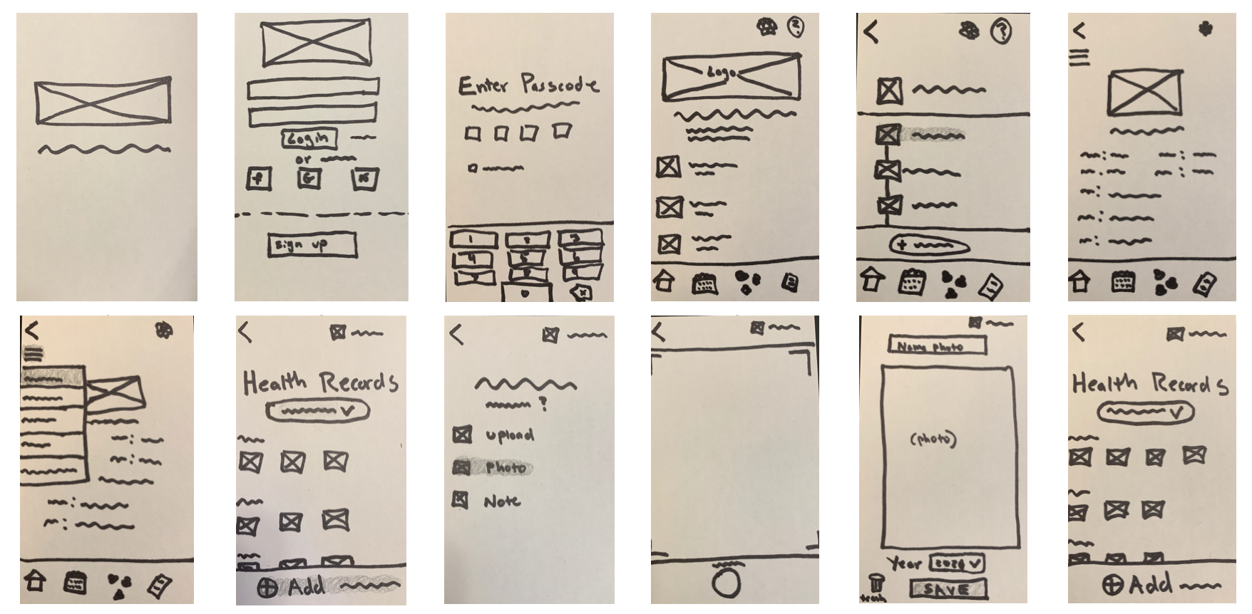
Low-Fidelity Wireframes- Adding an Immunization Record
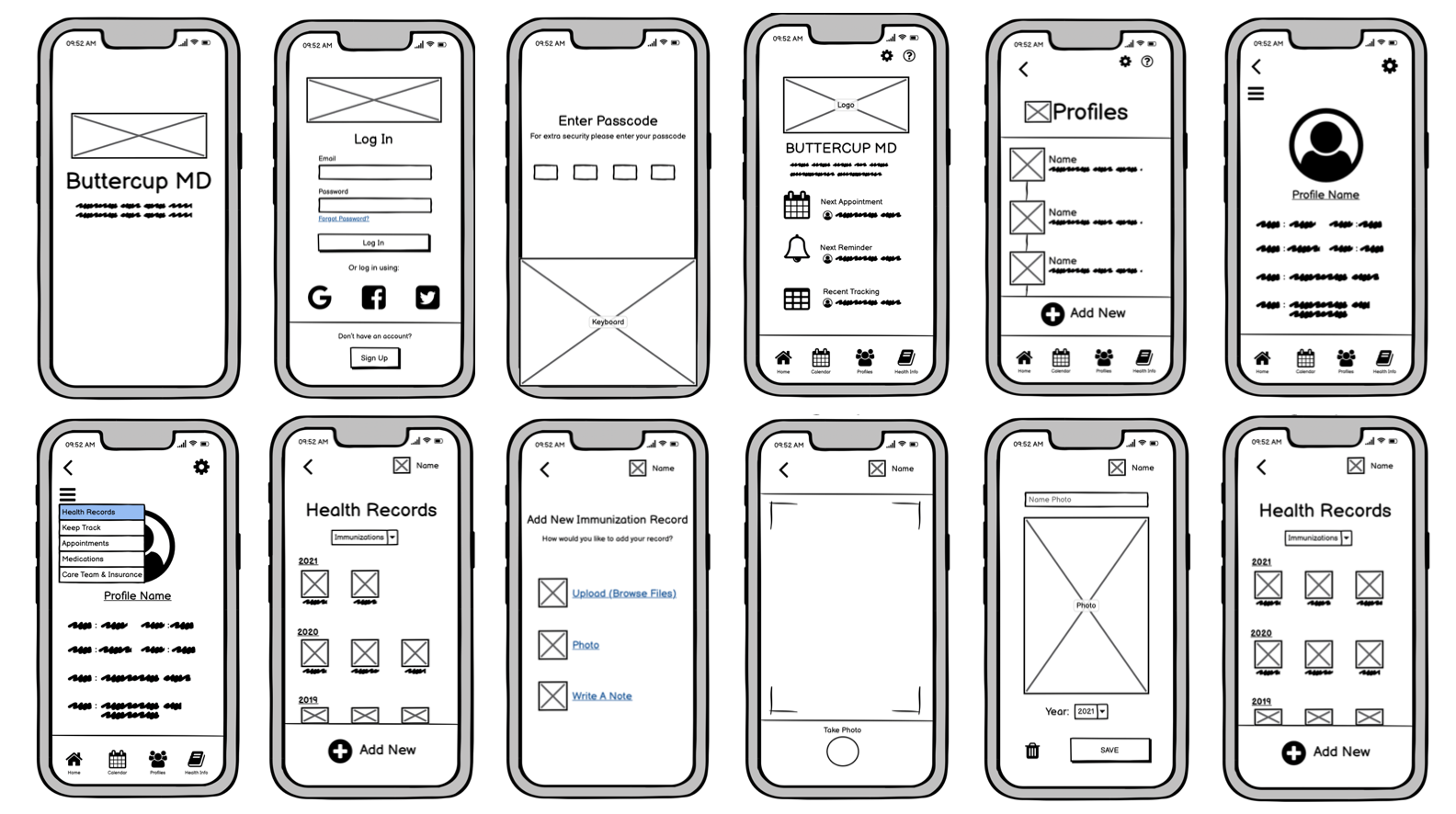
Mid-Fidelity Wireframes- Adding an immunization Record

Prototypes & Testing
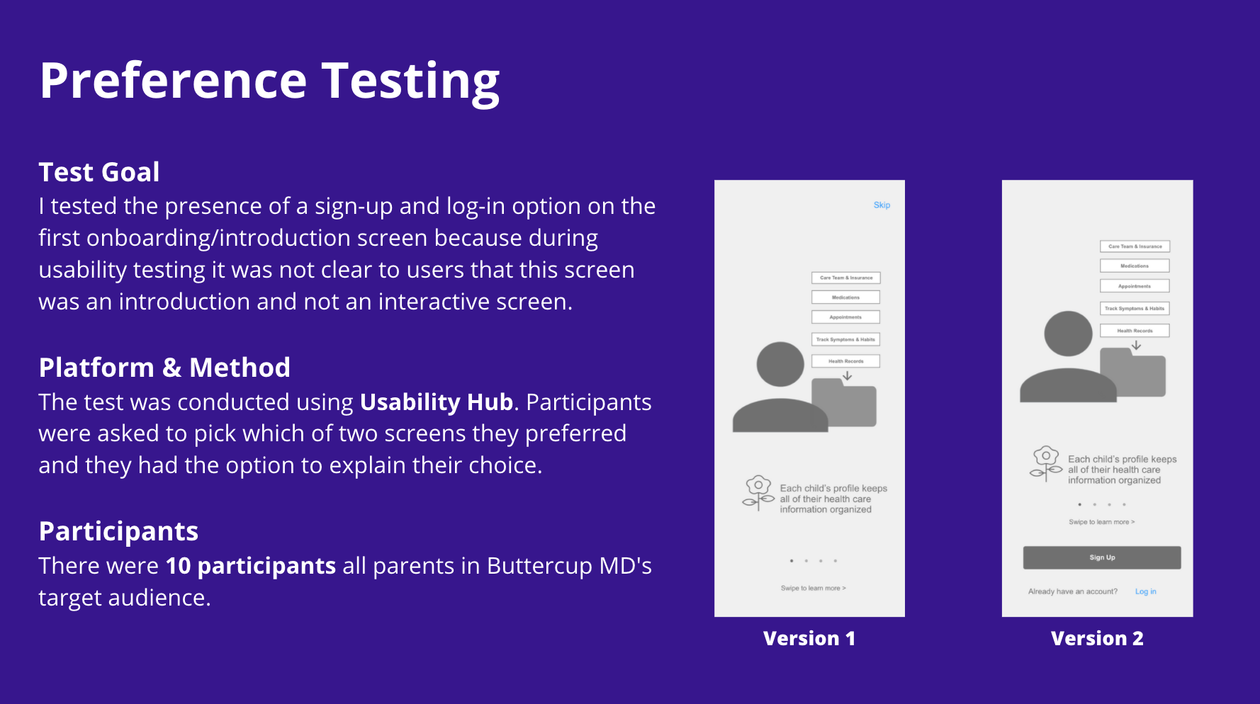
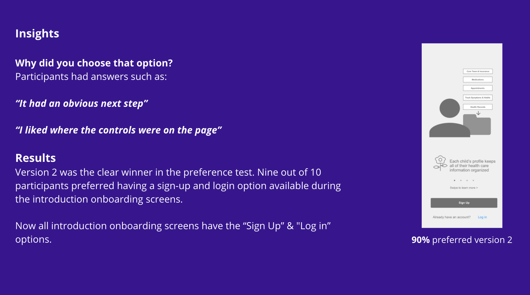
Usability Testing
I created a click-through mid-fidelity prototype to conduct usability testing on. To keep users from getting distracted by colors and visuals, I kept the design grey-scale in order to really test the flows and structure of information.
I asked users to complete the task flows I made for my personas.
For a more detailed look into the usability testing click on the links below:
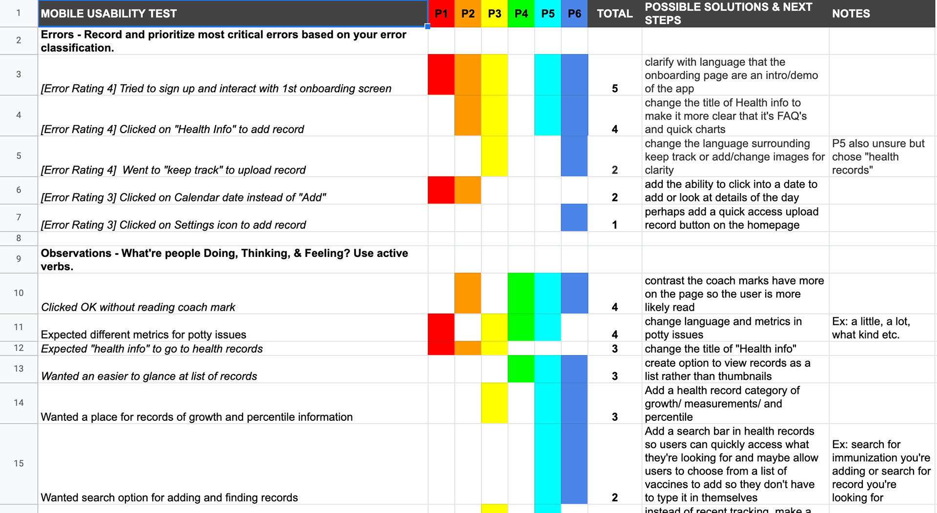
Analyzing The Results
After usability testing, I went through the recordings of the sessions and used Affinity Mapping and a Rainbow Spreadsheet to organize and analyze all of the information.
I looked for themes where multiple users had similar feedback and/or actions.
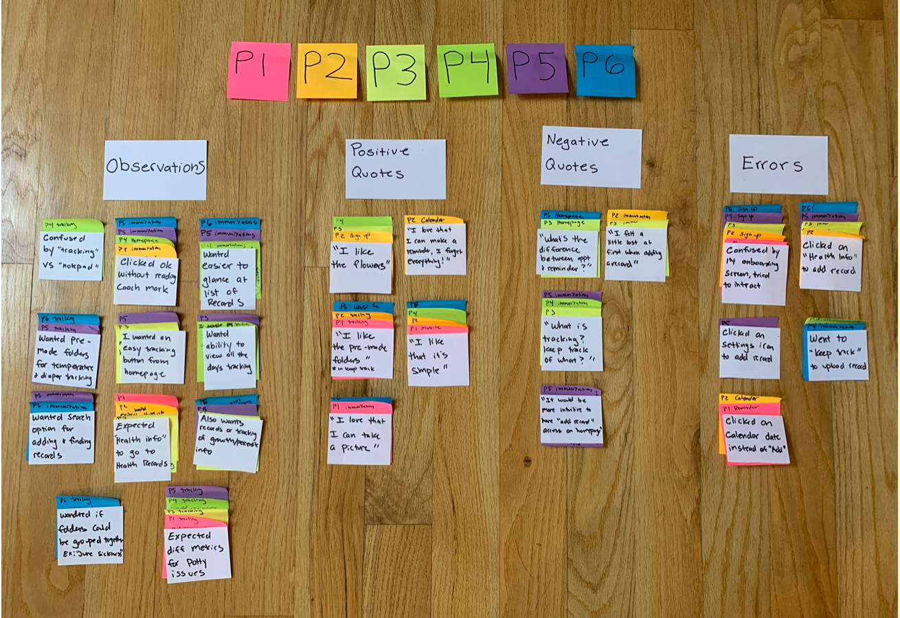
Affinity Mapping
Rainbow Spreadsheet
Users' issues fell into two categories:
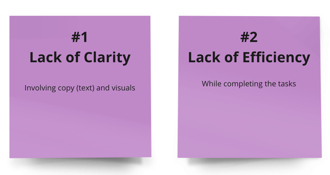
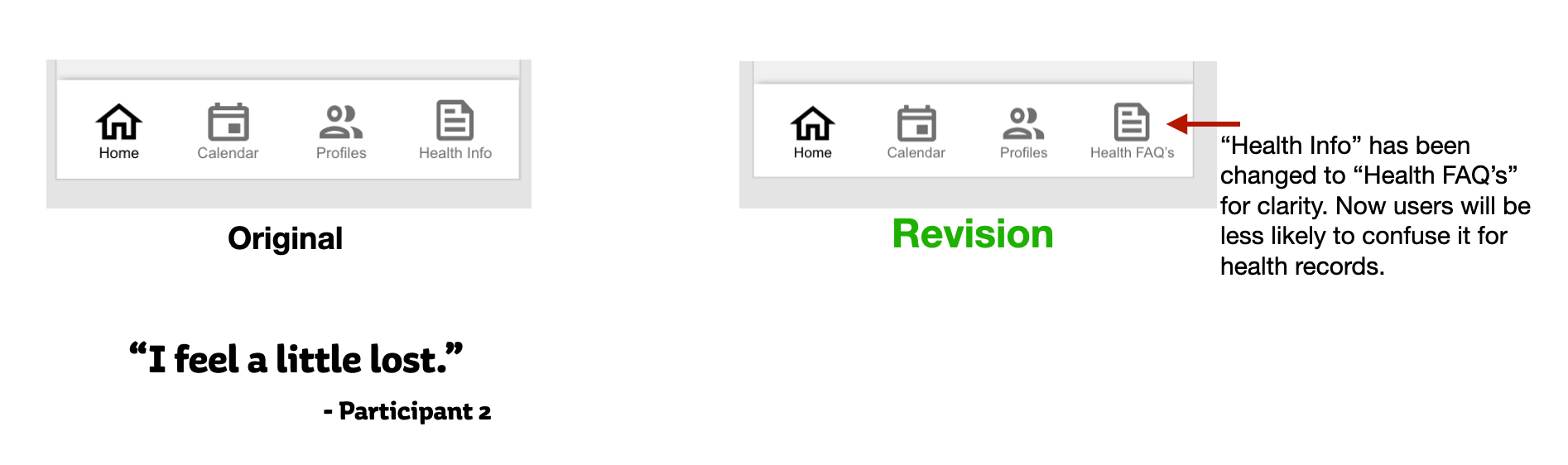
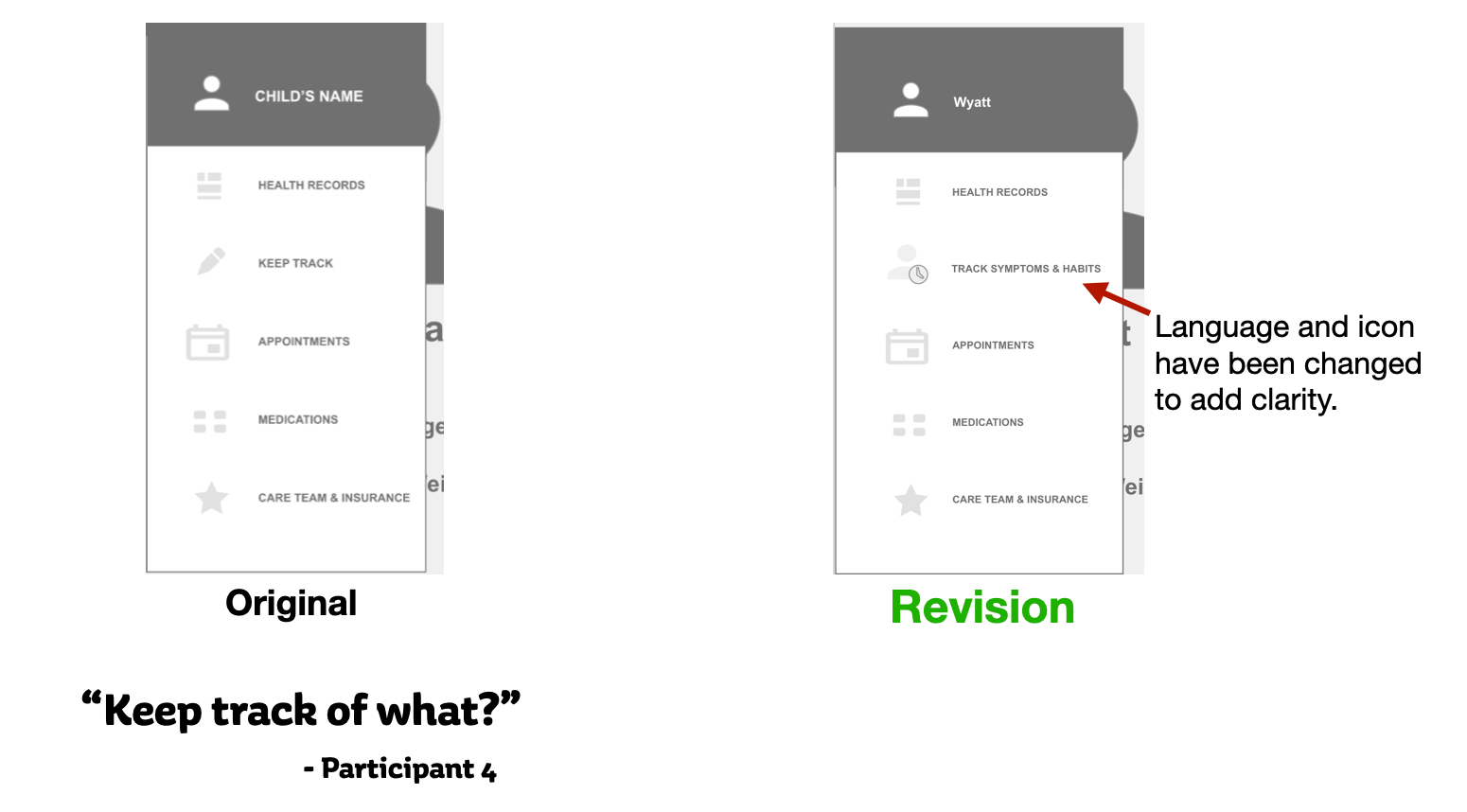
1. Lack Of Clarity
There were a few areas where users got lost, confused, or sidetracked when trying to complete a task. For example:
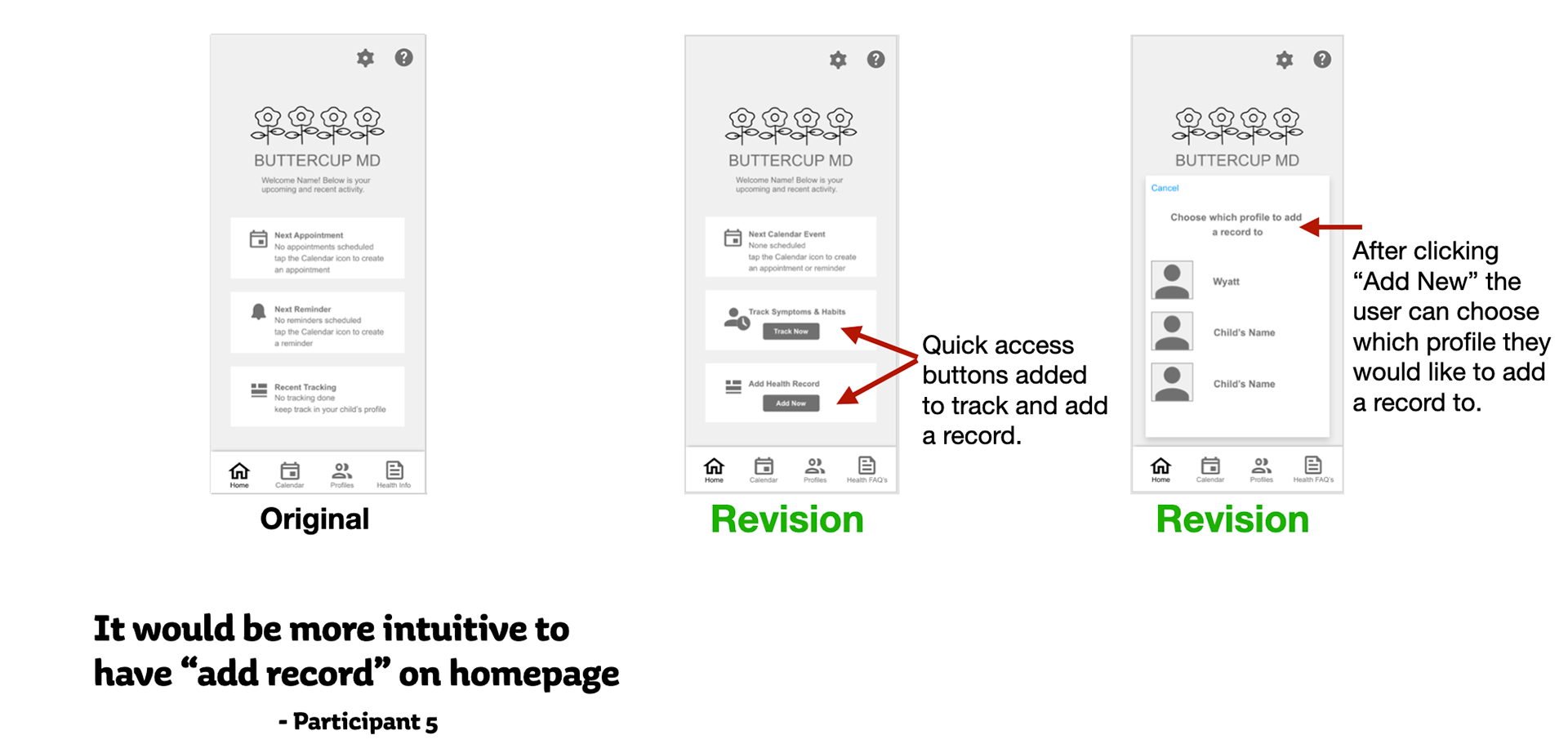
• When asked to upload a record users clicked on "Health Info" instead of the child's profile.
• Users were confused by what "Keep Track" was for.
When analyzing users' feedback I pinpointed the areas where I could add more clarity and made revisions.
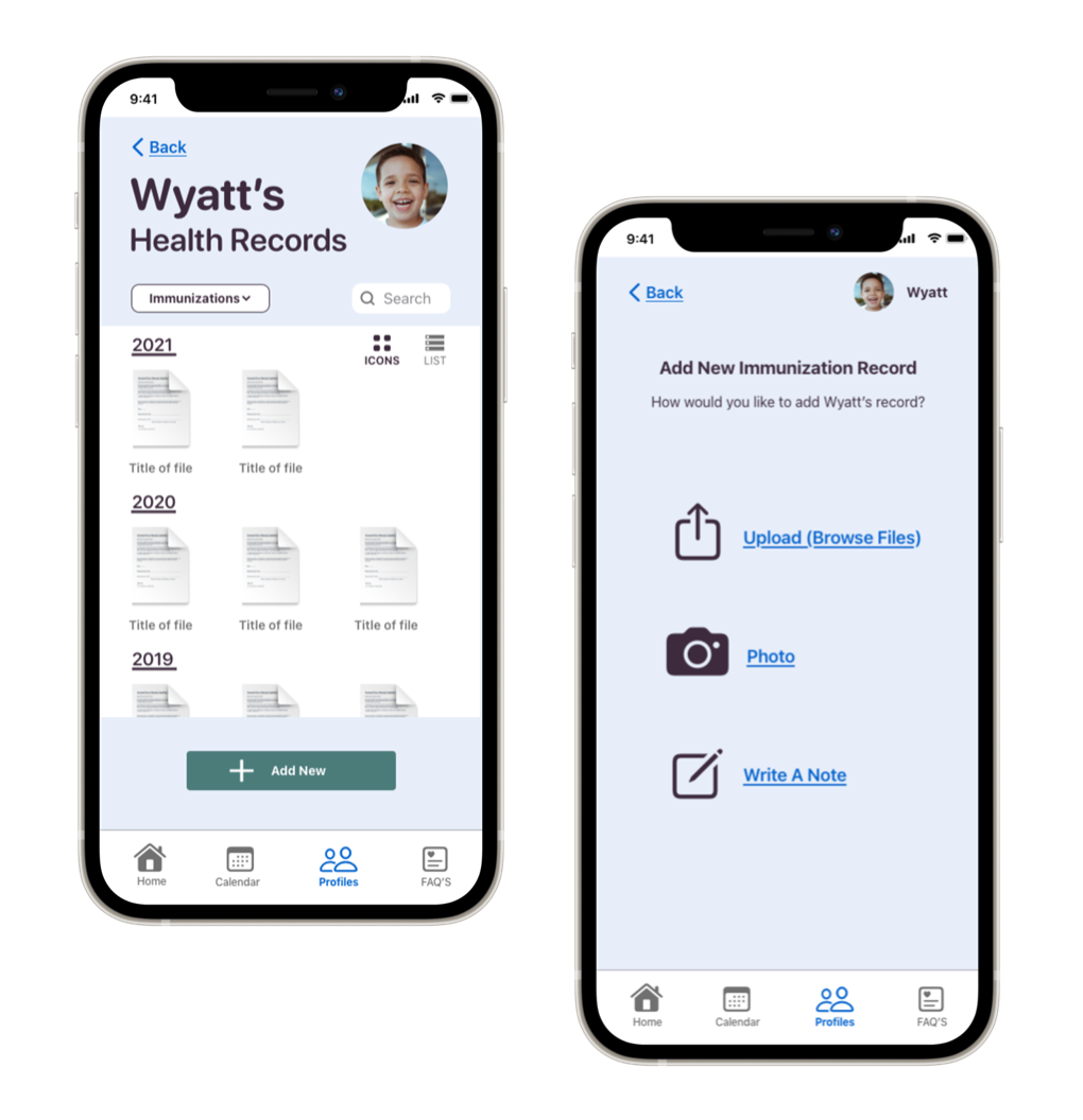
Adding a Health Record
Tracking a Habit or Symptom
2. Lack Of Efficiency
The whole point of Buttercup MD is to make parents' lives easier. Feedback from users really pointed out parts of the app that were not much more efficient than simply keeping paper records. For example:
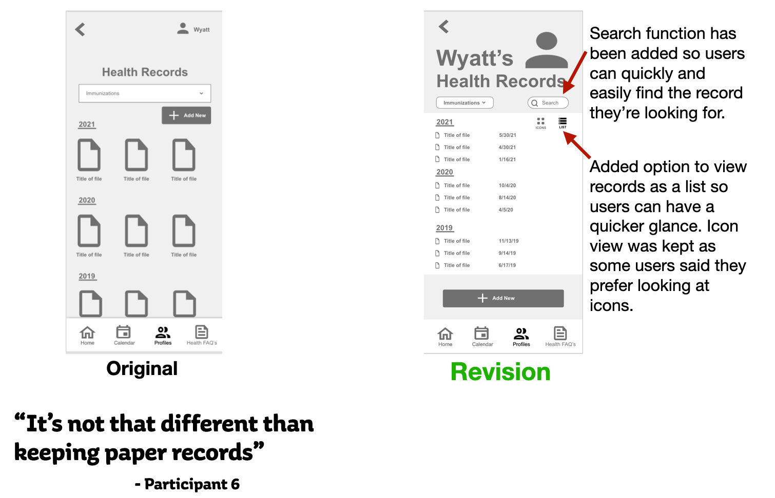
• Users noticed there wasn't an easy way to search through health records.
• Adding a health record or tracking a symptom did not have the most efficient flow.
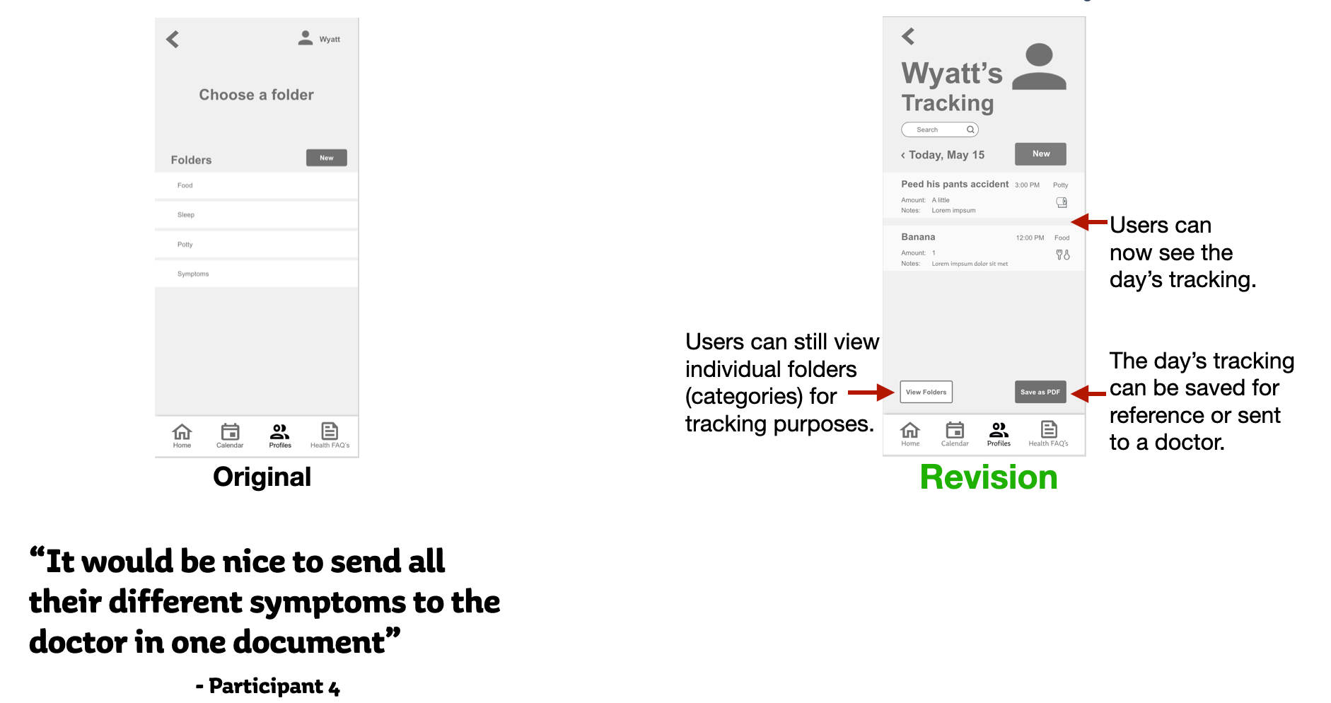
• When parents track a child's symptoms & habits they usually do it to find a solution to a problem or illness. It would be helpful to group multiple tracking categories together in an easy-to-read or easy-to-send document.
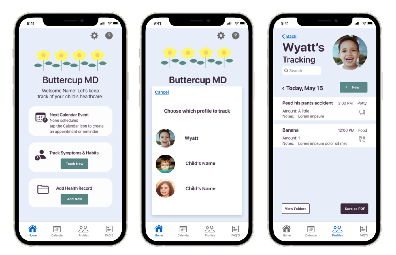
Quick Access From the Homepage
Adding a Health Record
Tracking a Habit or Symptom
Revised Task Flows
Revisions to increase the efficiency of Buttercup MD also resulted in updated task flows for the users.
Original Task Flow
Revised Task Flow
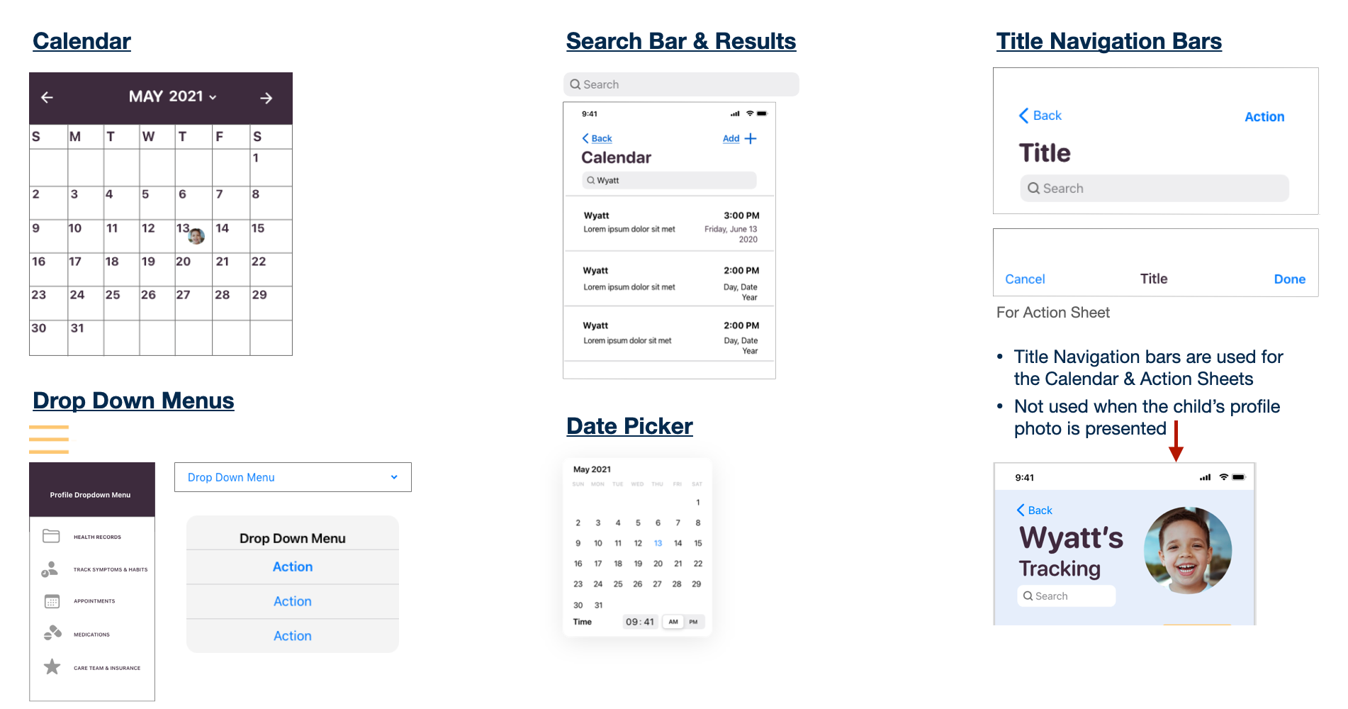
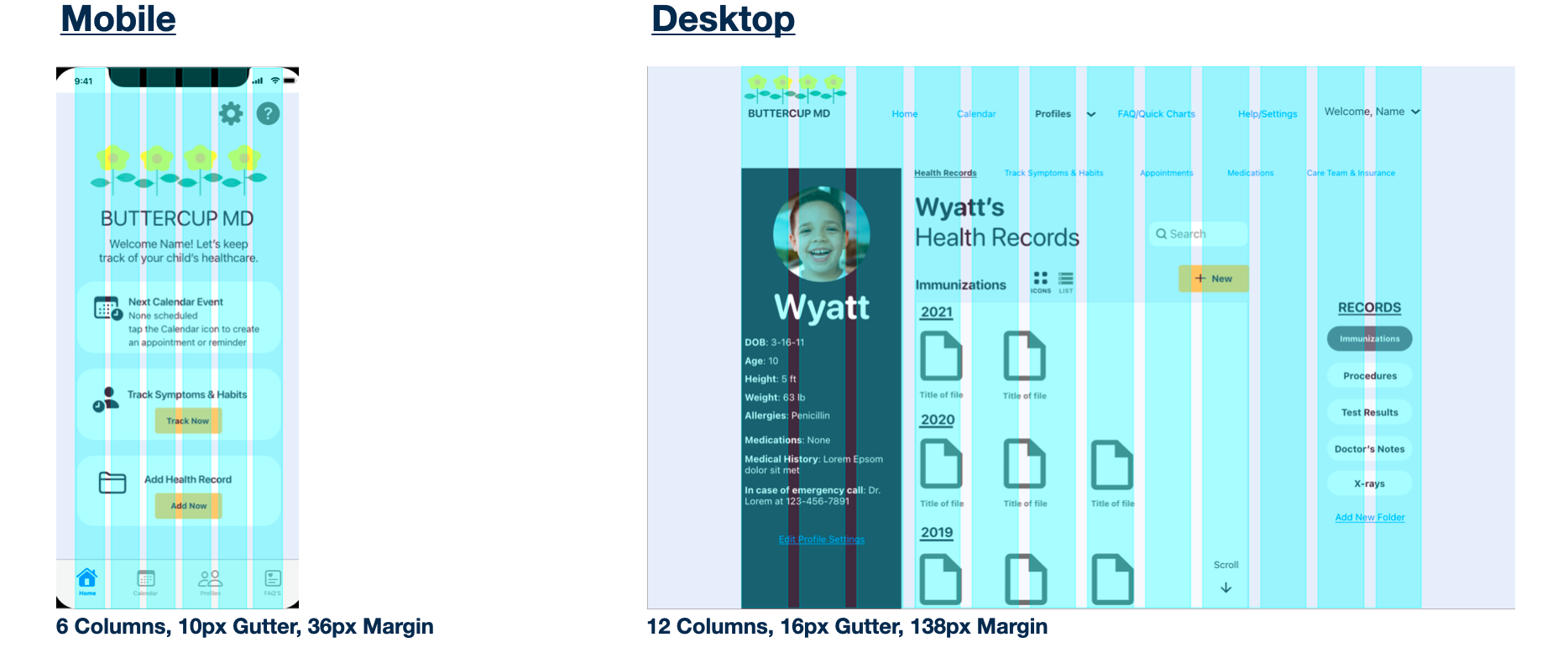
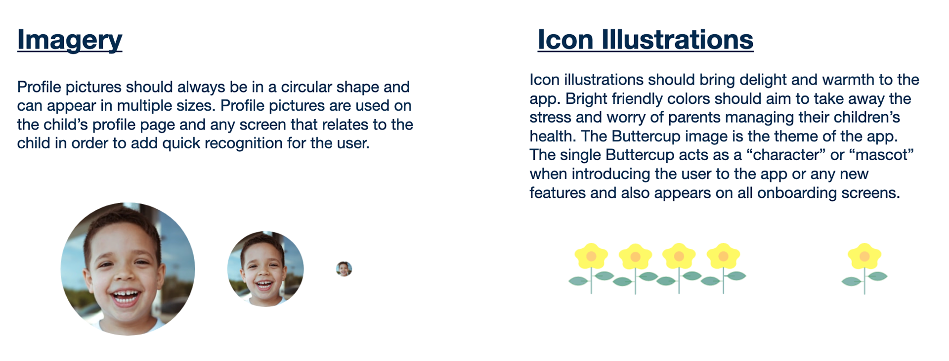
Visual Design
After making revisions from usability testing and users' feedback I worked on the visual design of Buttercup MD. My goal was to create a warm, safe, and comforting application that not only made parents' lives easier but could also:
Create an emotional connection.
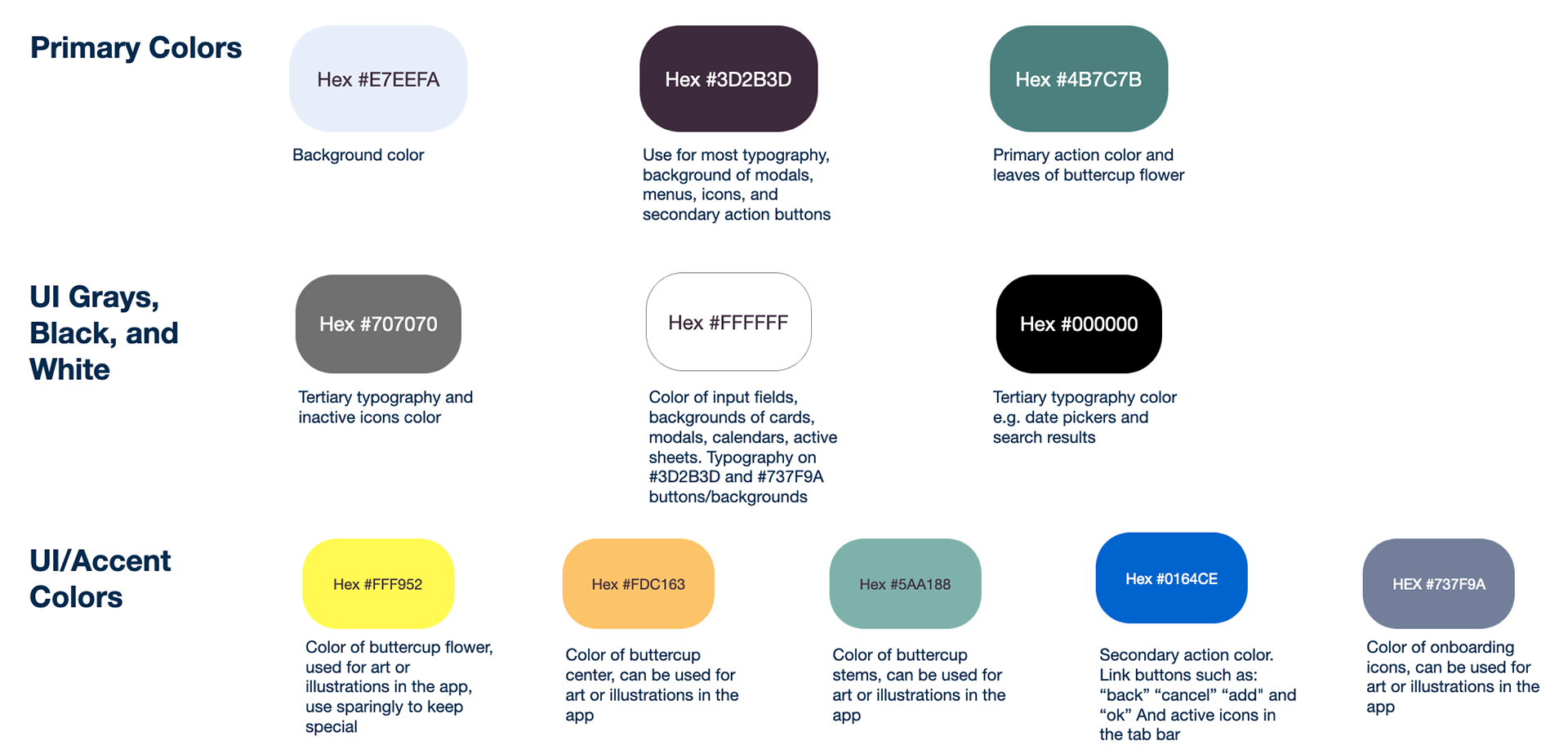

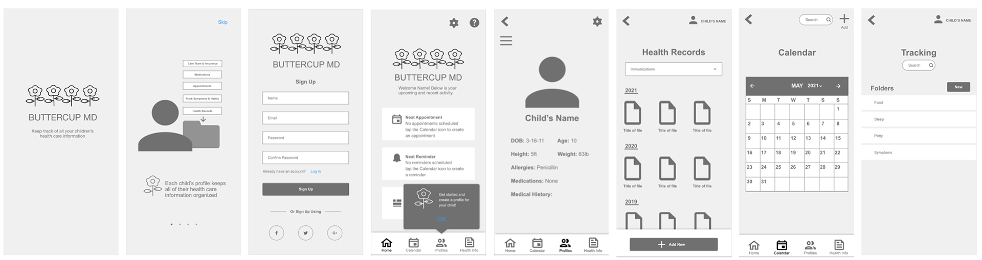
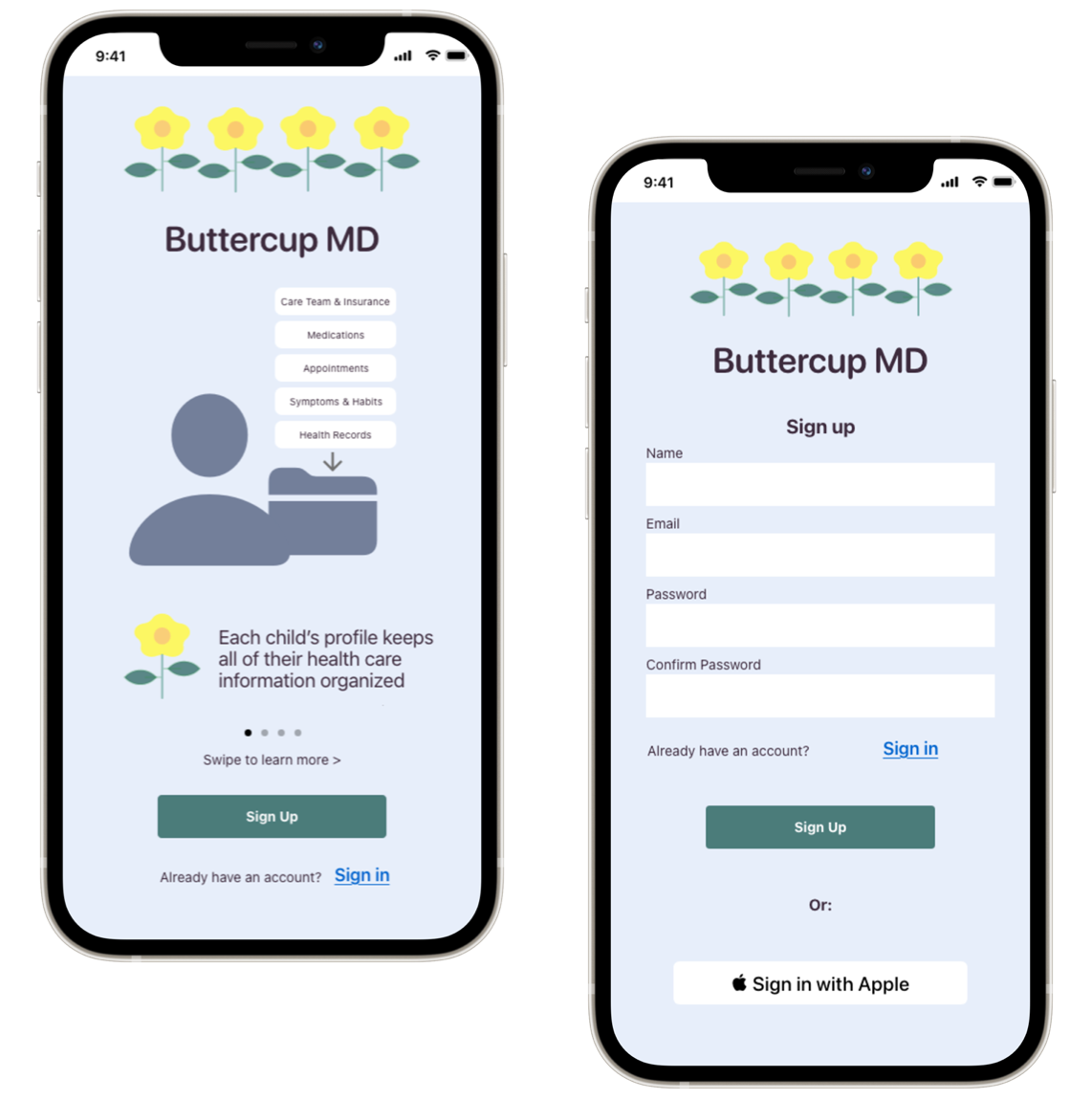
High Fidelity Prototype
Onboarding & Sign Up
Track Symptoms & Habits
Add A Health Record
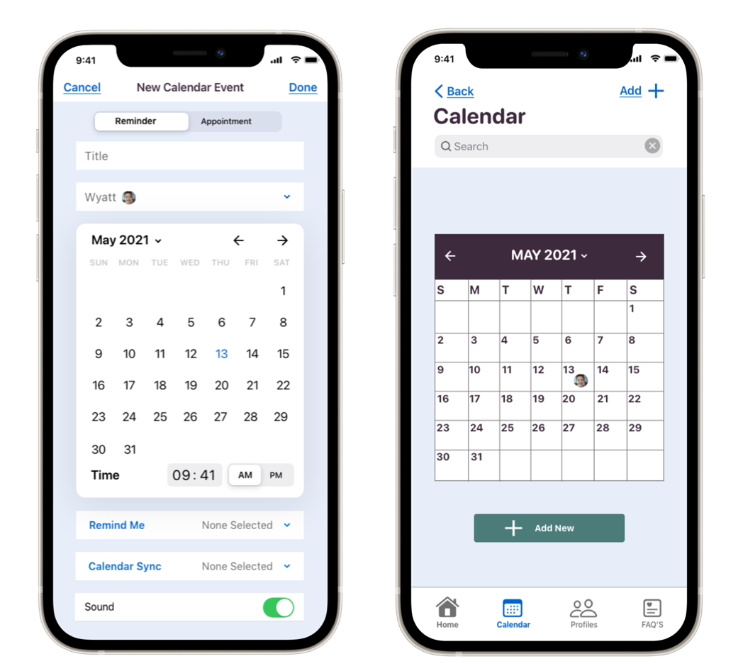
Schedule Appointments & Reminders

Prototype Link

What I learned
• Keep the problem in mind
Be careful not to get so far into the details that you forget the problem you're trying to solve.
In the future: I will be sure to keep the problem statement at hand to refer back to, so I don't forget about the big picture.
• Test and gather feedback early in the process
Get ideas and prototypes out there quickly because that's where the learning really happens, and that's where it's possible to create the right design for the people who will be using the product.
In the future: I will share and test ideas, prototypes, and designs more quickly so I can learn the most important information in the most informative and efficient way.
• Always keep accessibility in mind
I went through many iterations of my visual design because the colors I originally used together were not accessible. This opened the door to realizing how much more there is to learn about accessibility in design.
In the future: I am committed to ensuring my designs are inclusive and accessible. I will educate myself on the best practices and stay up to date with accessibility guidelines.
Let's Connect!
I'm looking for job opportunities to make a meaningful impact as a UX designer.