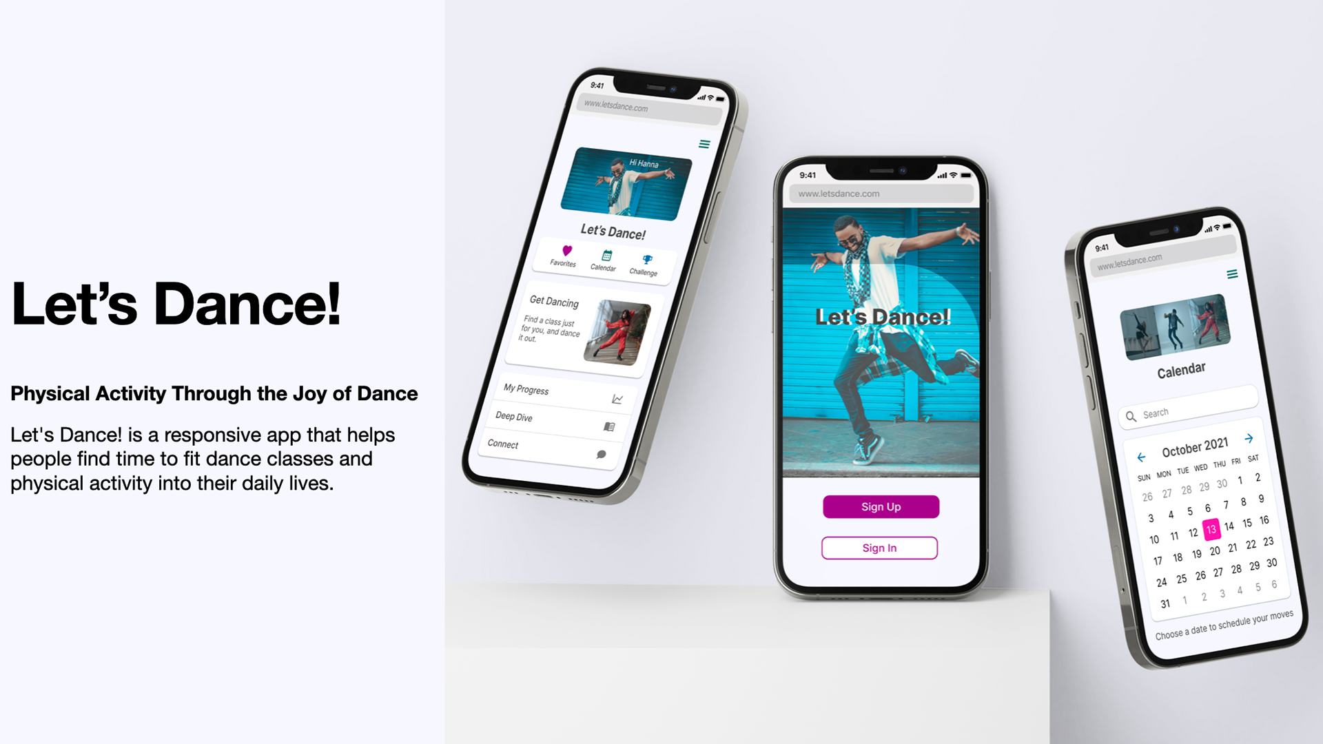
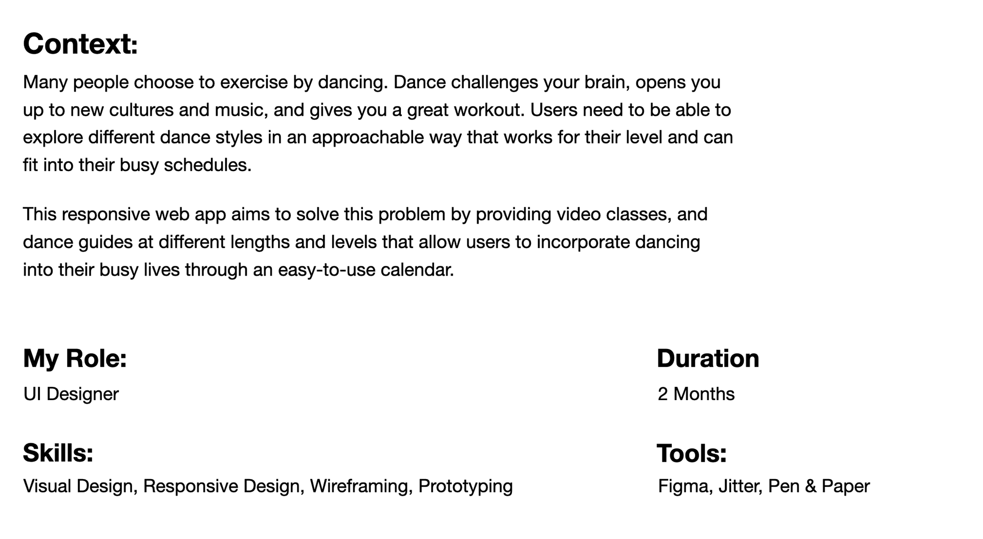
Overview
UX Framework
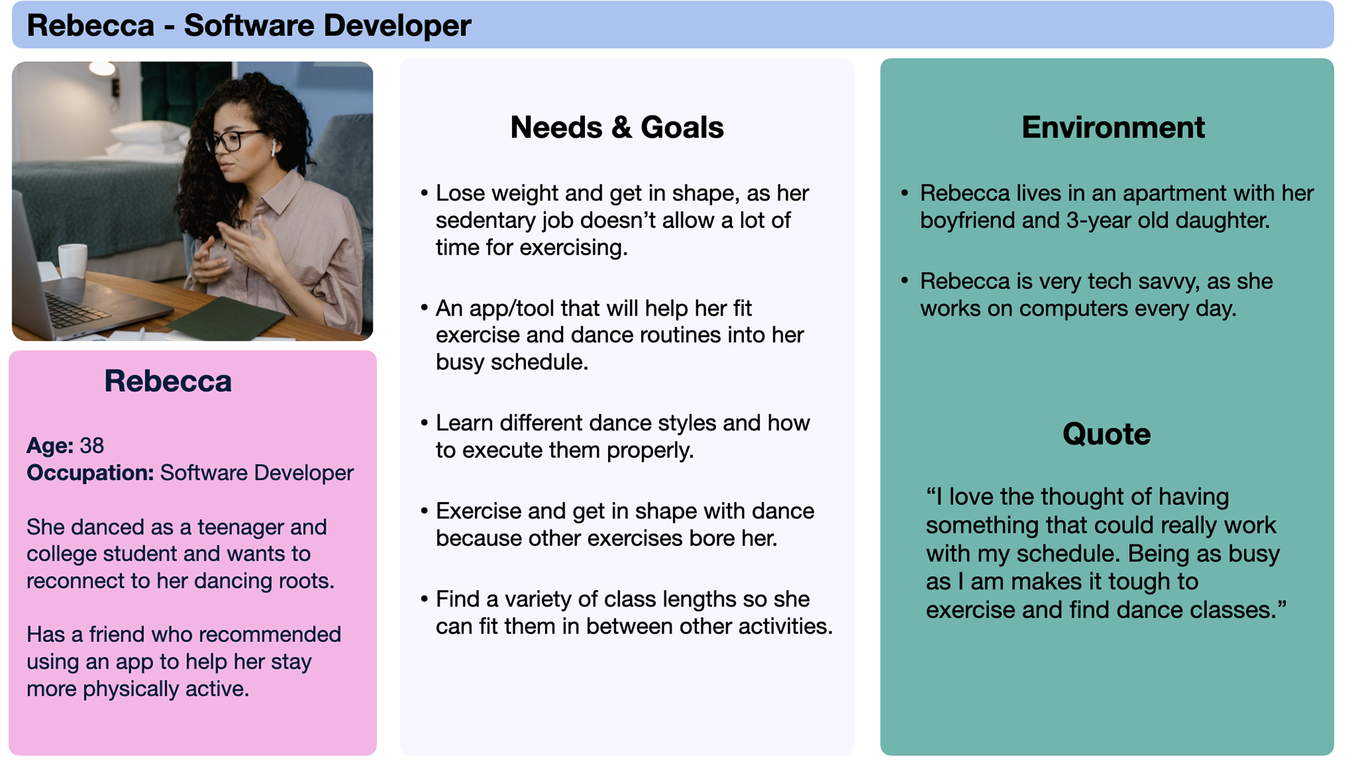
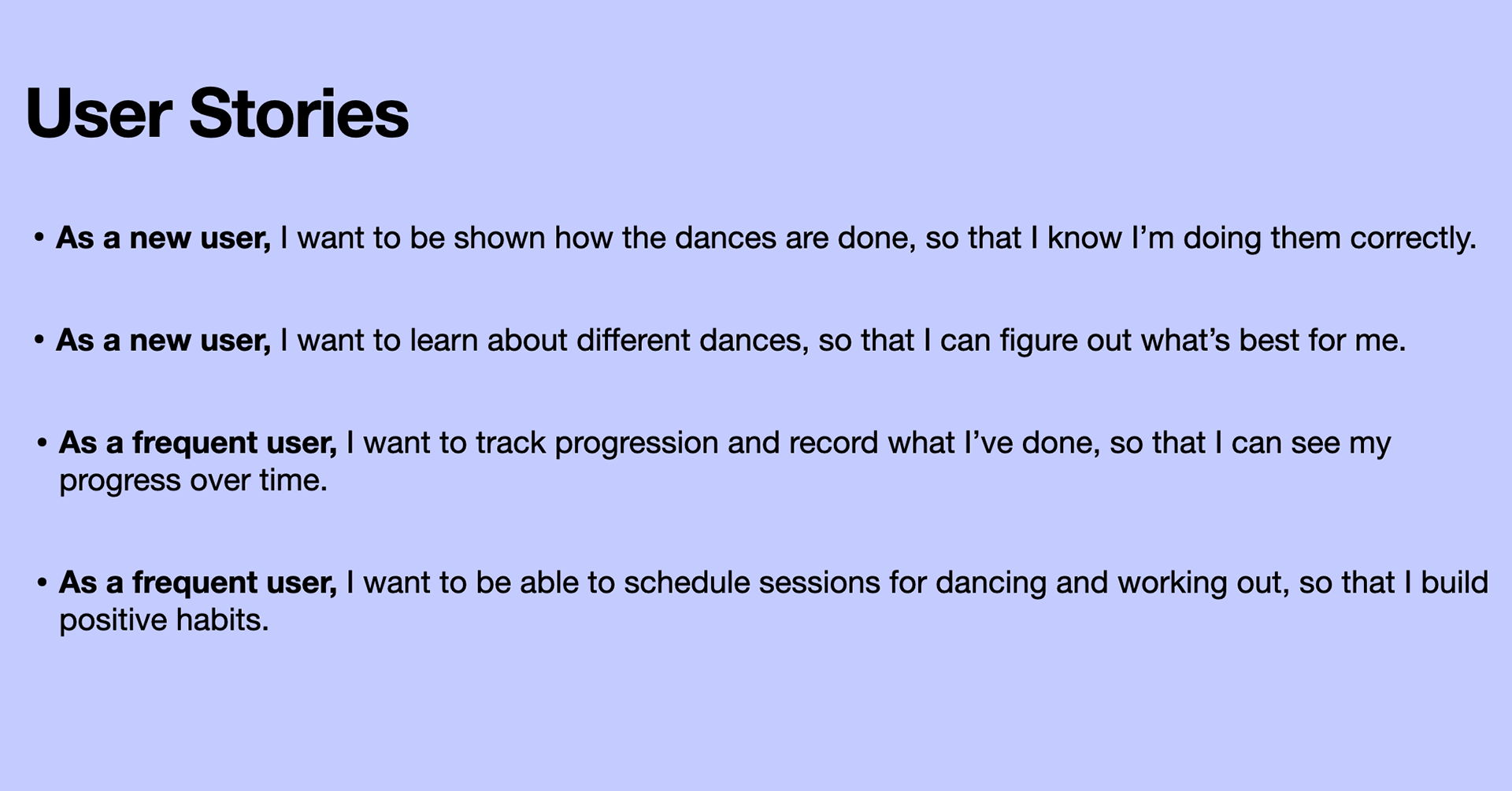
Before working on the visual design I started with a persona, user stories, and user flow, to inform the direction of the design and the features that would be included.
Persona
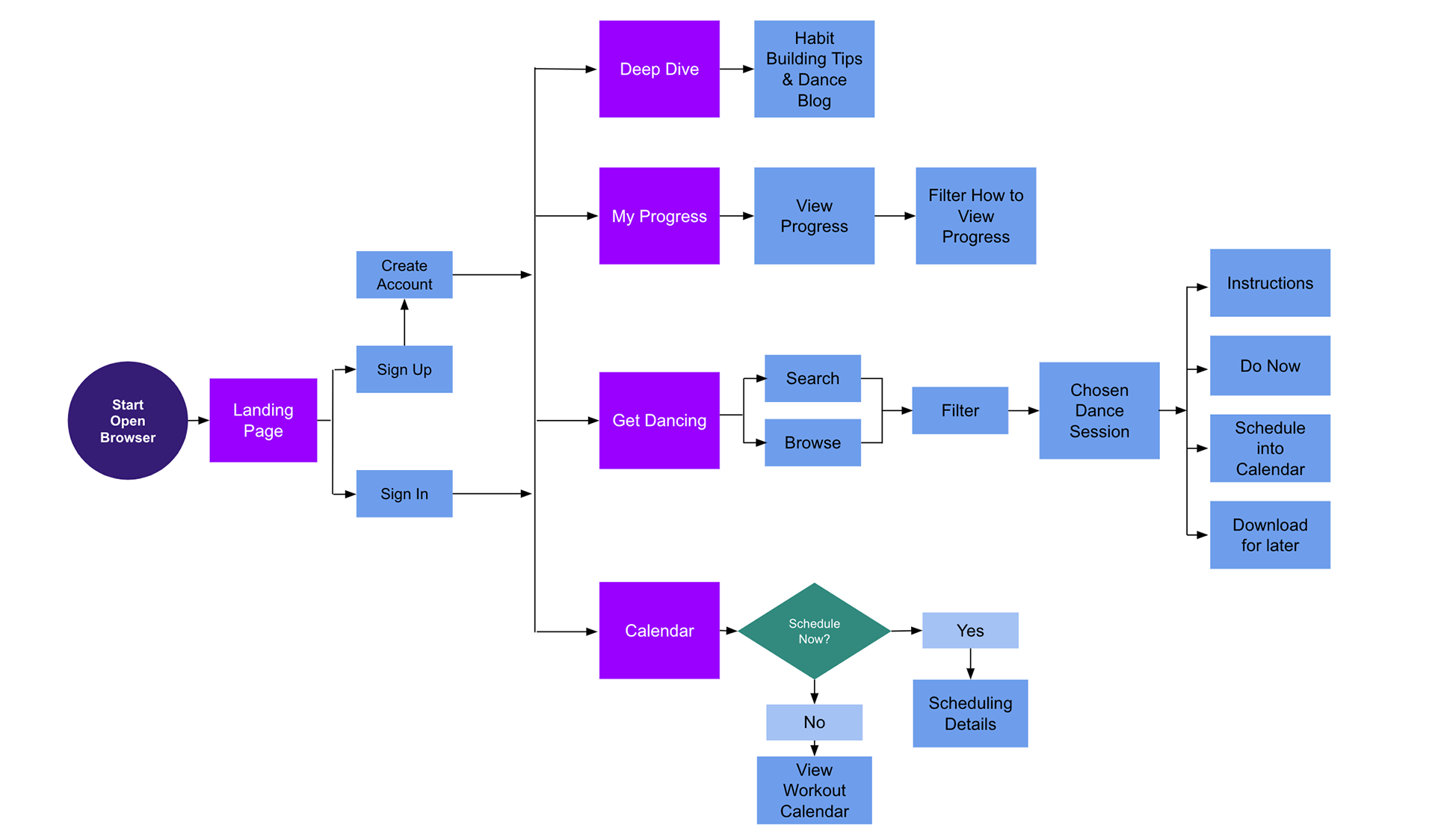
User Flow
I created a user flow to demonstrate how users might move through the app and to ensure they're able to accomplish their tasks and goals efficiently.
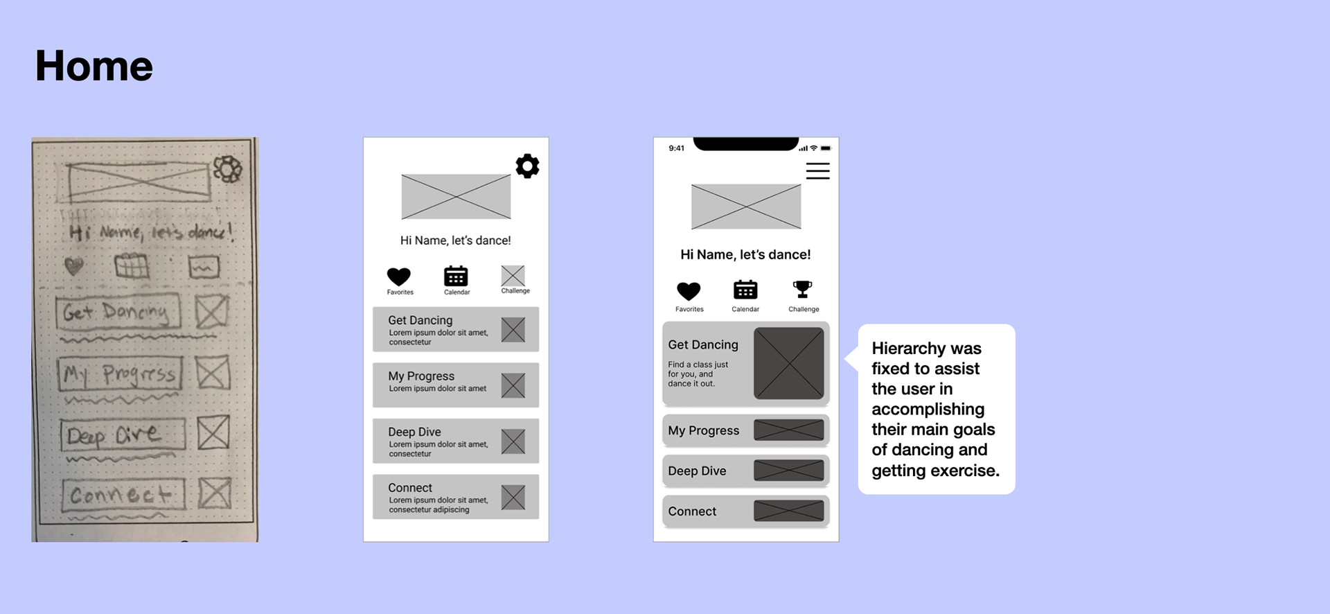
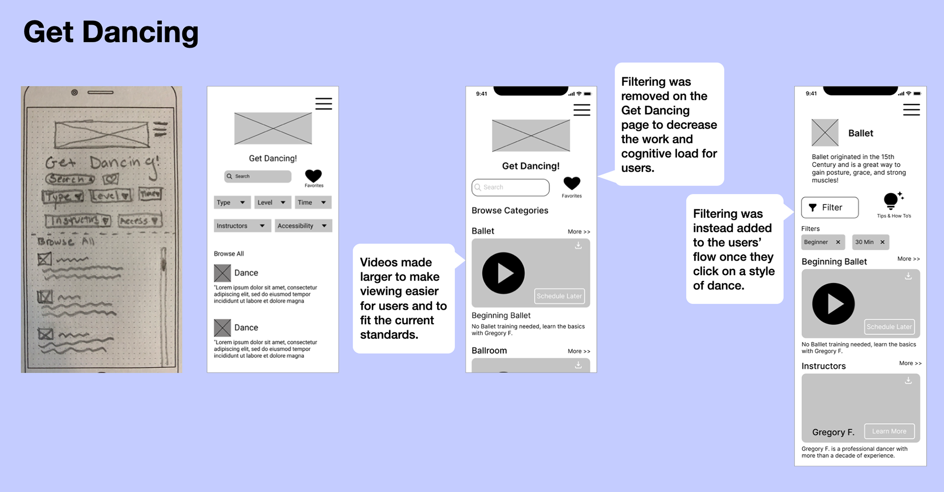
Wireframes
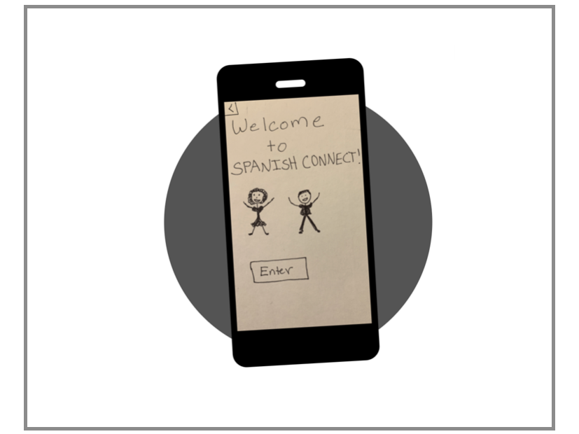
Next, it was time to turn my ideas into a tangible flow. I created low and mid-fidelity wireframes and immediately started iterating and improving on the design as I kept the users and persona in mind.
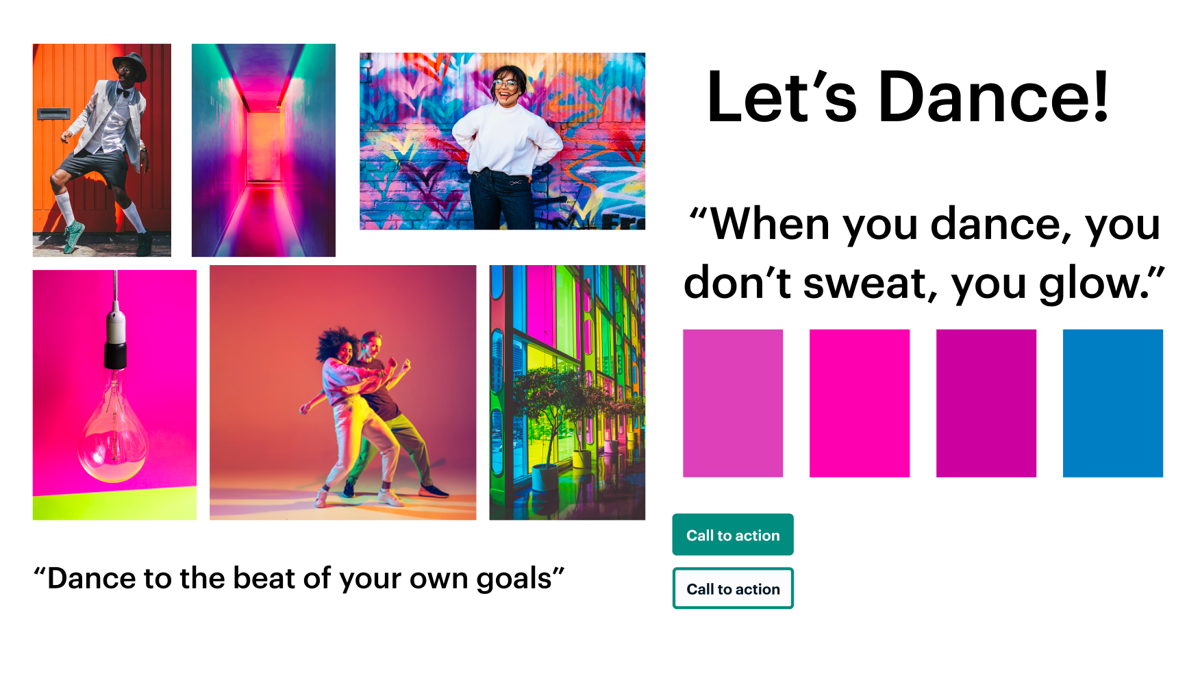
Moodboard
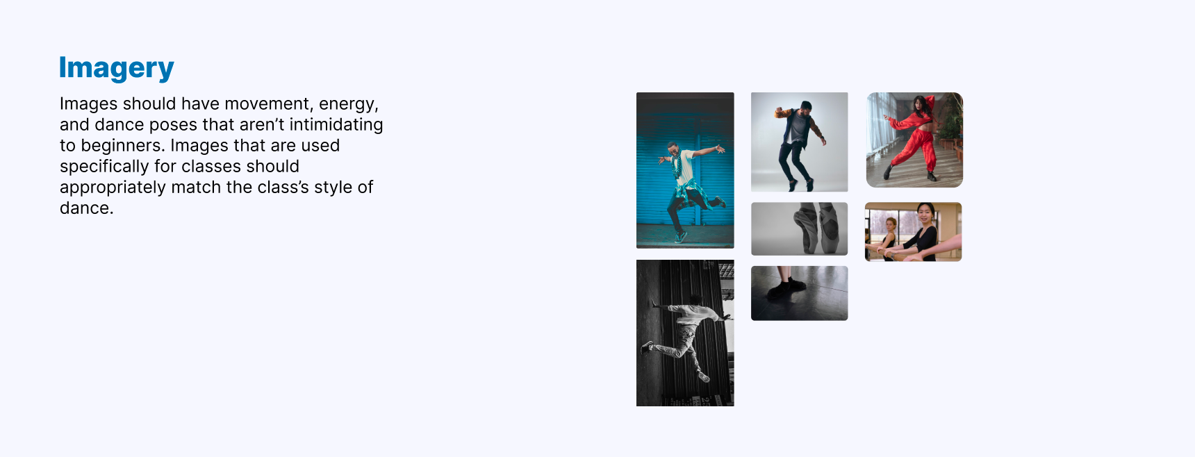
I created a moodboard to use as a starting point for the visual design of the app. It was helpful to use this as a visual reference for the project. I included strong vibrant colors meant to energize and motivate users in an encouraging way.
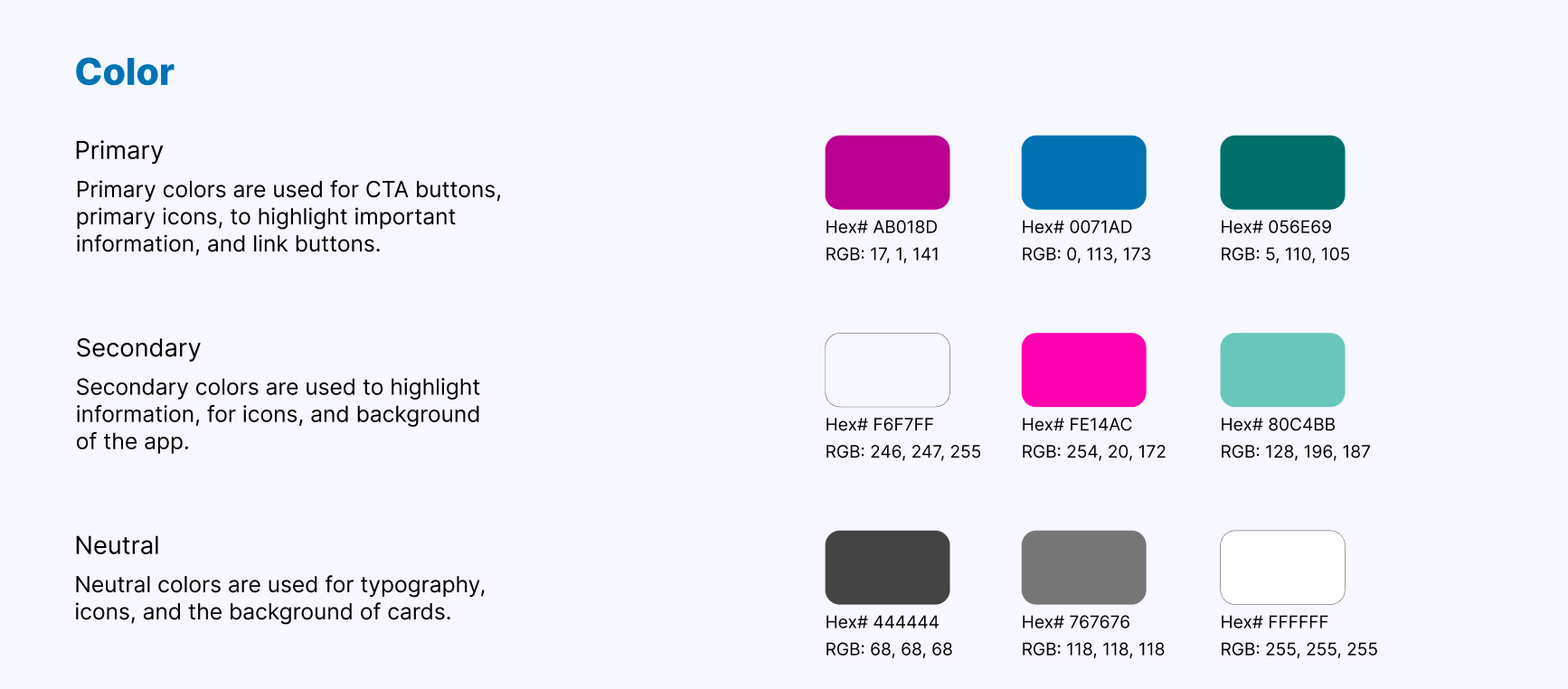
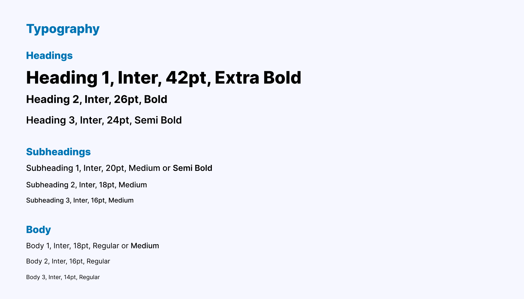
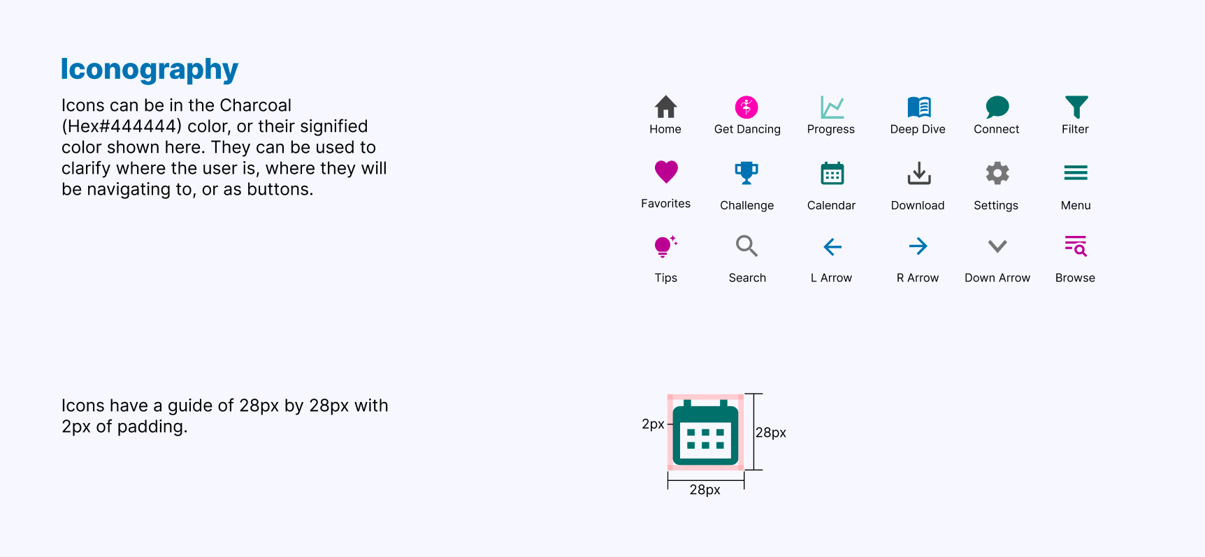
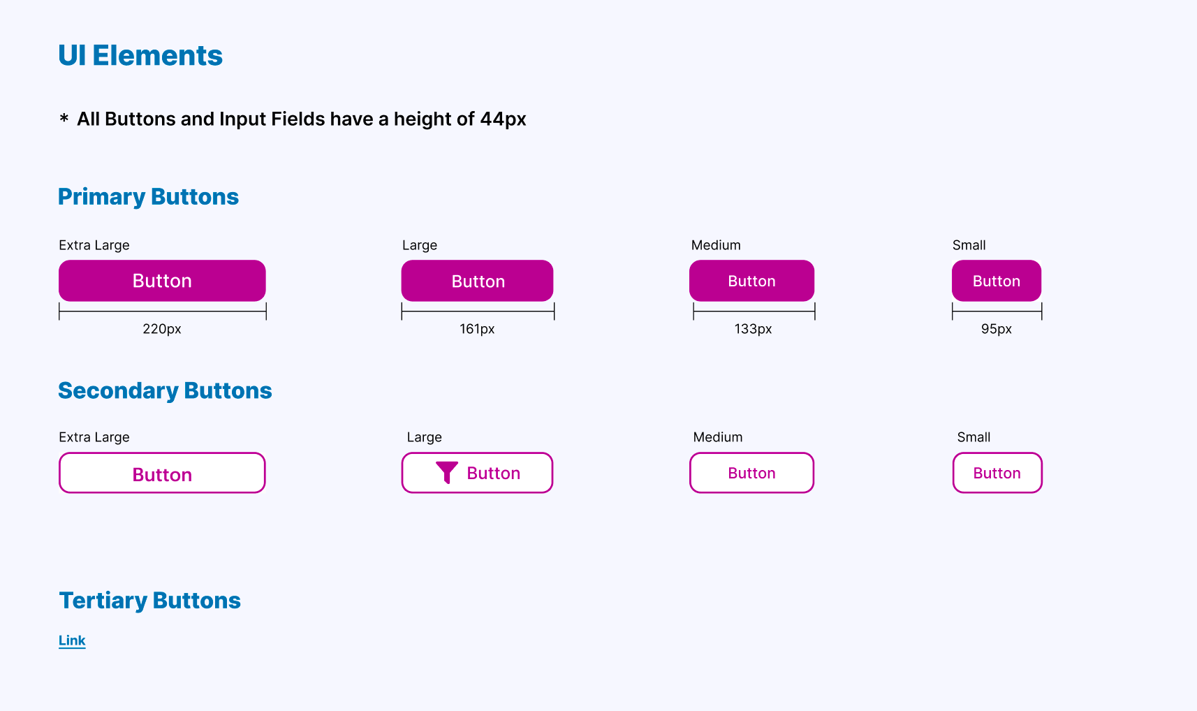
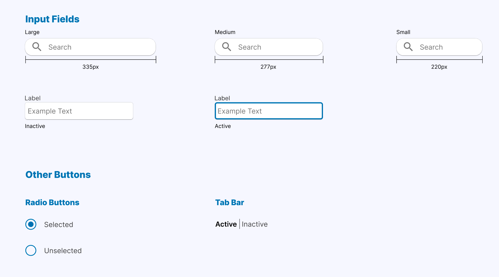
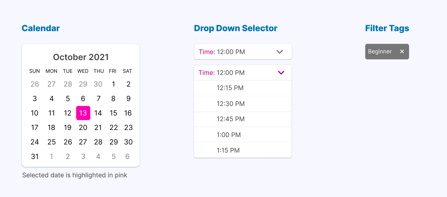
Style Guide
Creating a style guide was extremely helpful in solidifying the visual design and setting guidelines that improved the look and feel of the app.
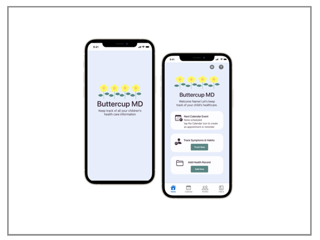
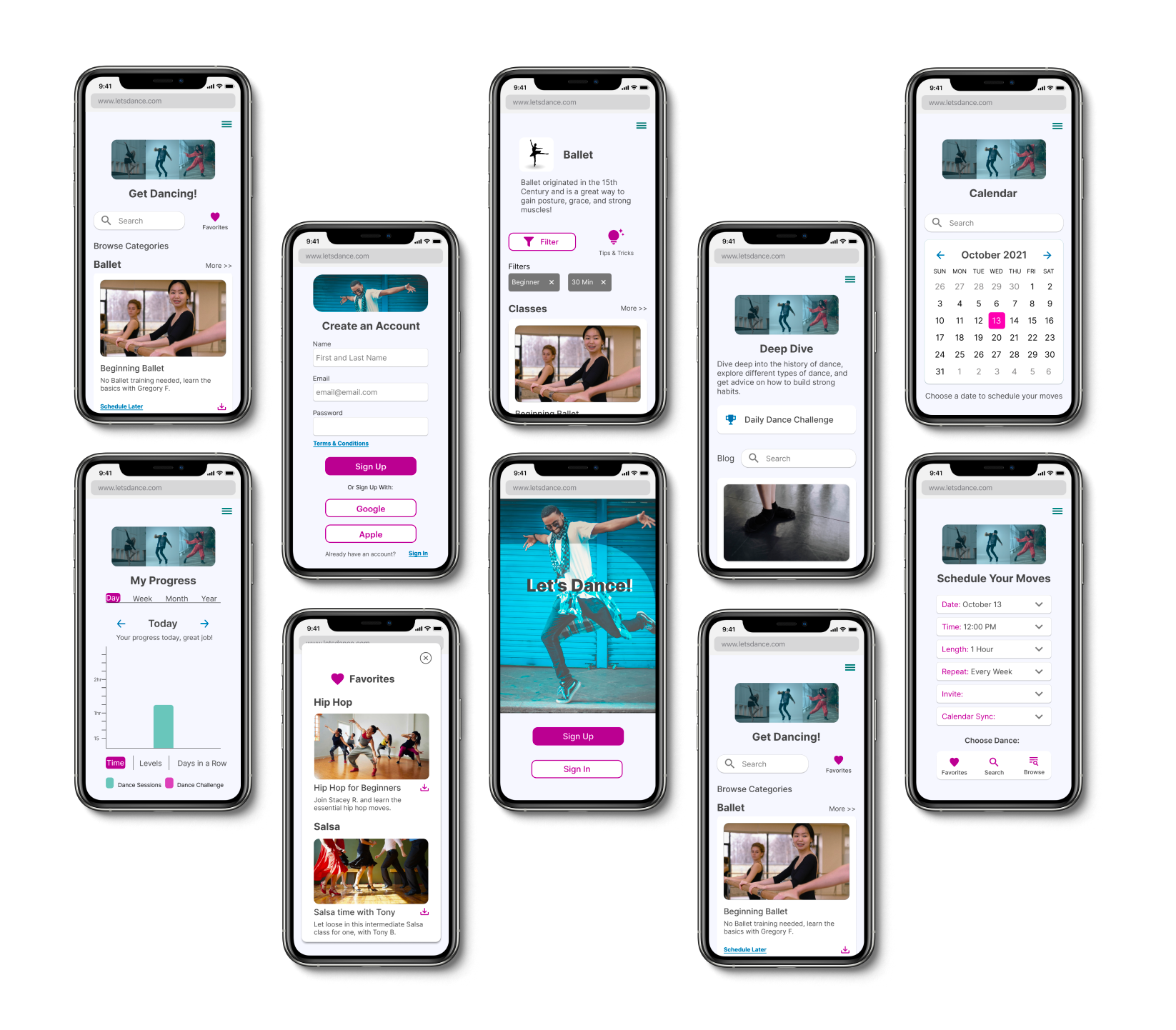
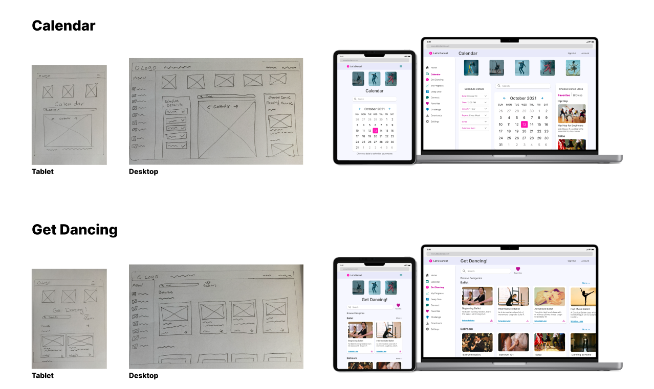
High-Fidelity Screens
Bringing it Back to the User
While polishing and iterating on the final designs, I made sure to refer back to my user stories and persona to make sure the design was solving the users' problems.
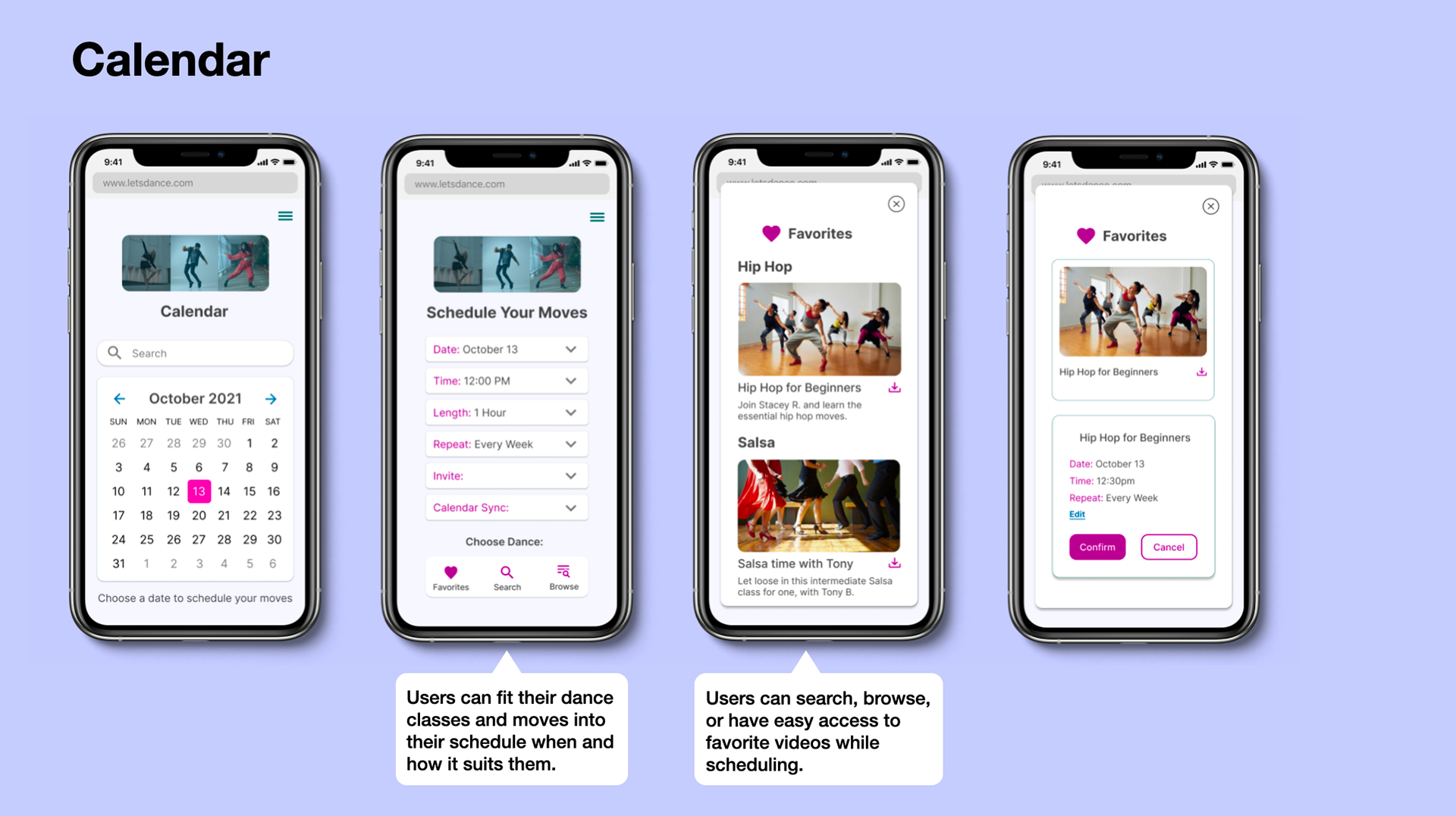
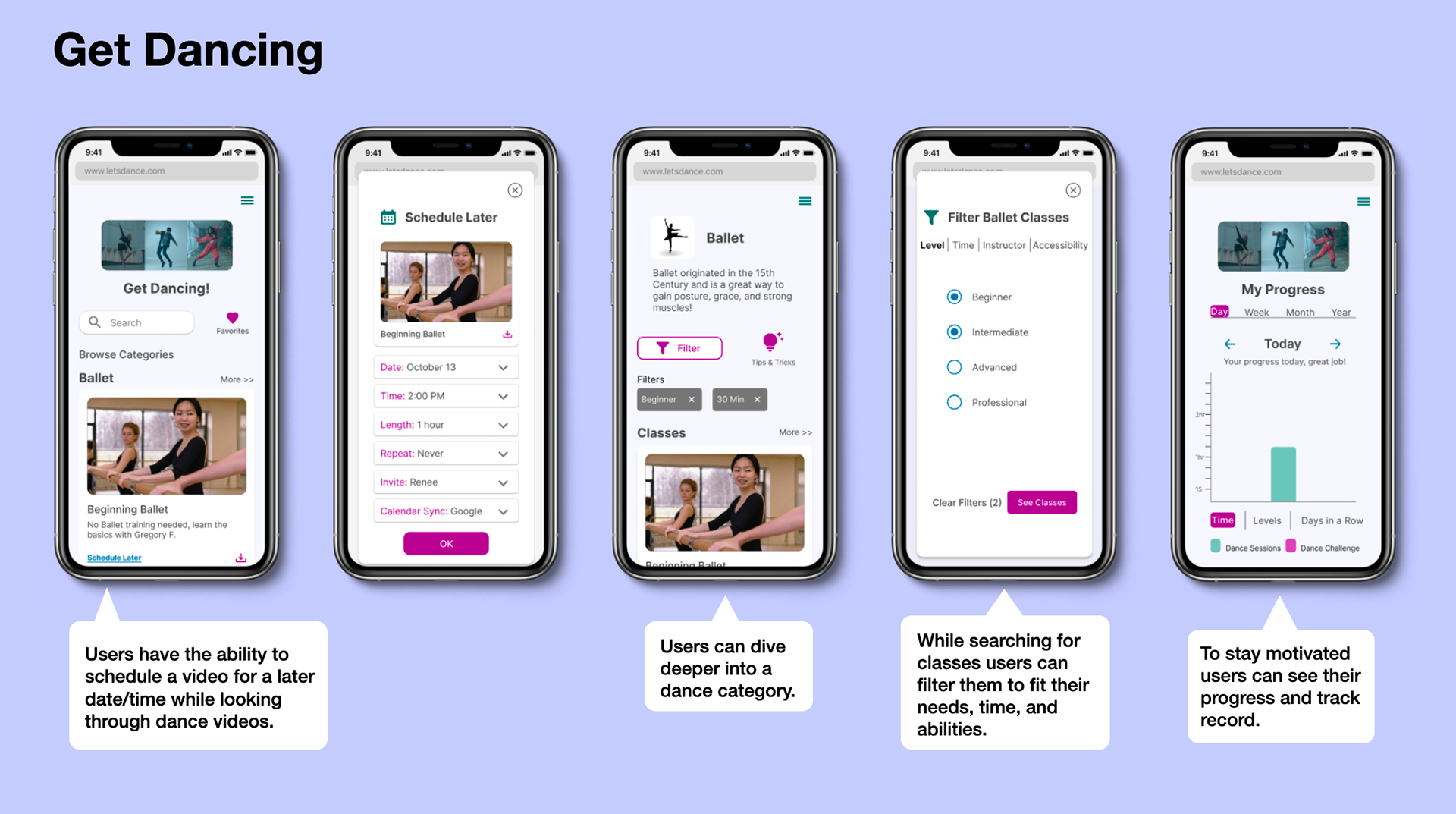
The Design in Action
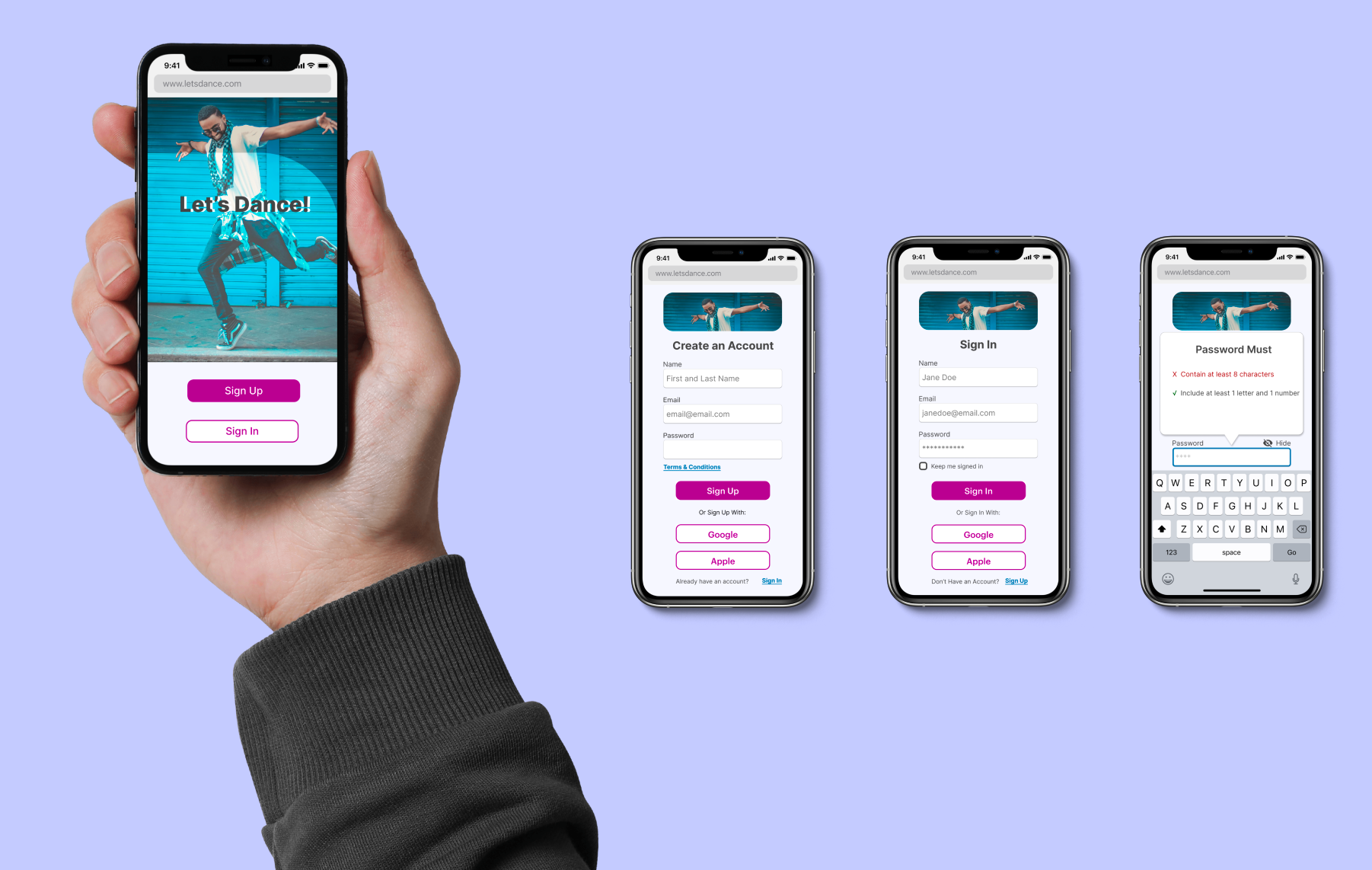
After creating high-fidelity screens I focused on the gestures and interactions users would have while using the app. I included a logo animation for when a user creates an account, added vertical and horizontal scrolling for ease, and made a slide-in menu so users would be able to easily navigate around the app. To see some of these gestures and animations in action click below.
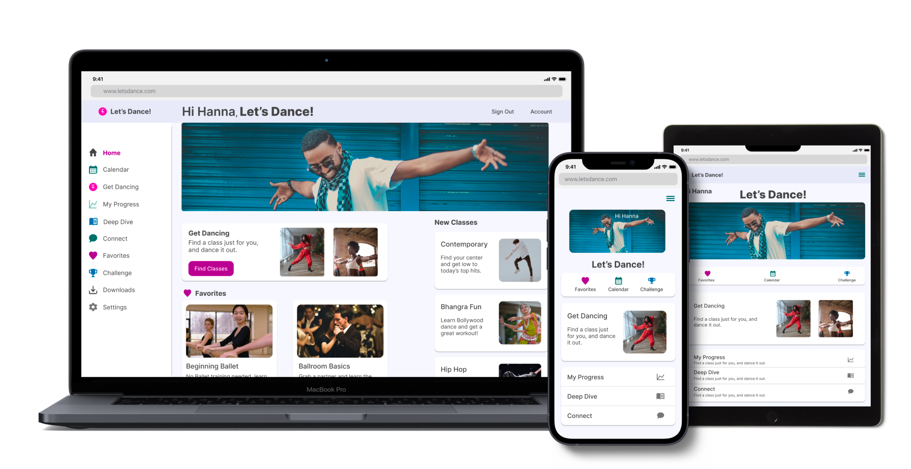
Responsive Design
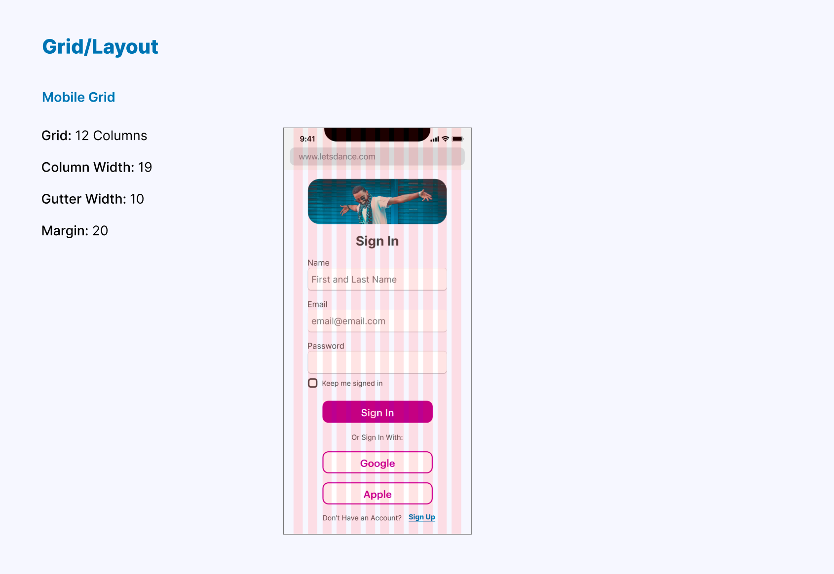
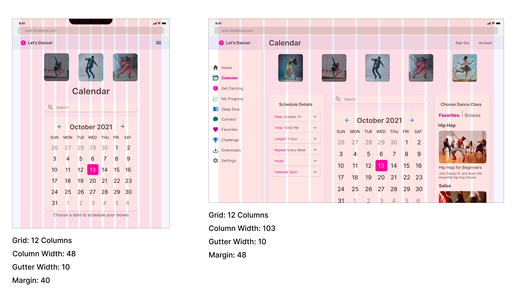
I used a mobile-first approach for this project in order to start with the essential features and functions. I then designed the project at different breakpoints. I adjusted the margins for each breakpoint and added a side menu to the largest breakpoint to create an organized layout. Using a grid system and guidelines for each breakpoint ensured that the look and usability of the app stayed consistent for the user.
Grids at Different Breakpoints
Final Designs
Interactive Prototype
Explore the Let's Dance! prototype below.
Lessons Learned
• Set up guidelines and grids early
Early in the process of this project, I found the visual design lacking a cohesive and user-friendly feel. I followed many design principles and focused on the hierarchy and typography of the app but something was still not right. It wasn't until I really buckled down on the different UI elements of the app such as card layouts and the size and padding of icons that the feel of the design had more consistency less cognitive load.
• Consistency is key
As I learned the importance of setting up guidelines and grids early in the design process I also realized how that consistency added to the usability and feel of the design. Understanding the importance of consistency was something I thought I had a grasp on and it seemed an obvious lesson when I encountered it in the past. However, I finally understood it on a different level, that it's not just using the same colors for the same actions or keeping elements the same size throughout an app. It's also the consistency of layout, padding, groupings, and everything that goes on the screen.
Let's Connect!
I'm looking for job opportunities to make a meaningful impact as a UX designer.
Contact me